Overview
Goal
LeGrand, a commercial lighting company, asked us to evaluate the interface to their best in class lighting controller. Our team had 12 weeks to design and validate 4" and 7" versions of interface.
Rather than a conference light switch with four buttons and presets, they wanted to emulate a smart home interface that was both simple but highly configurable. It had to work for users with little knowledge of complex lighting setups.
Additionally, the installation configuration software required a laptop and specialized software. They wanted newly installed systems to be able to be configured directly via the wall-switch screen.
My role
I was the sole interaction designer, assisted by a project manager, visual designer, and user researcher.
What we did
We held a three day requirements gathering session informed by an heuristic evaluation. I enumerated the requirements as user stories which informed a site map. I designed and prototyped an application which we tested with end users. We explored visual designs and tested user preferences.
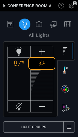
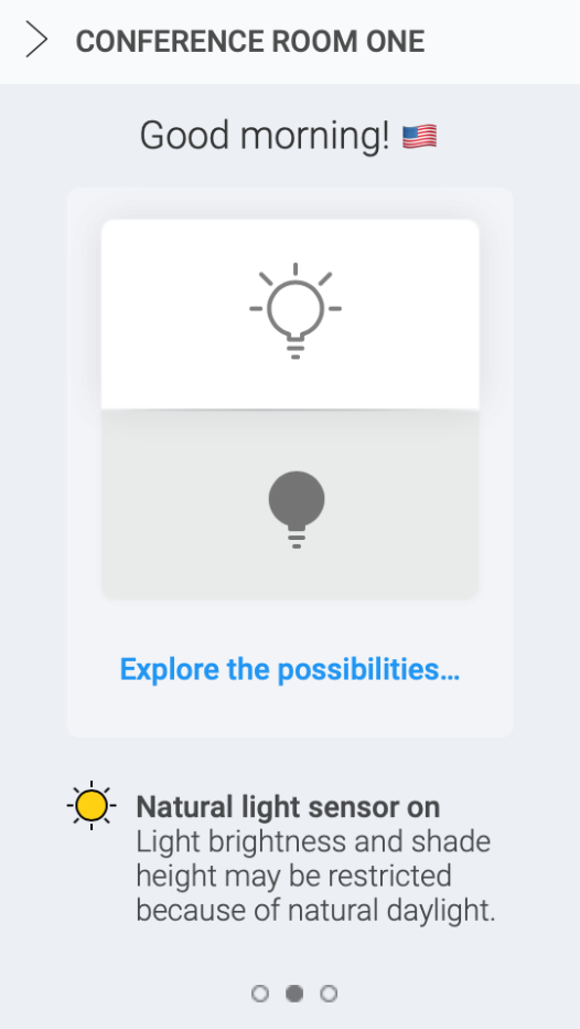
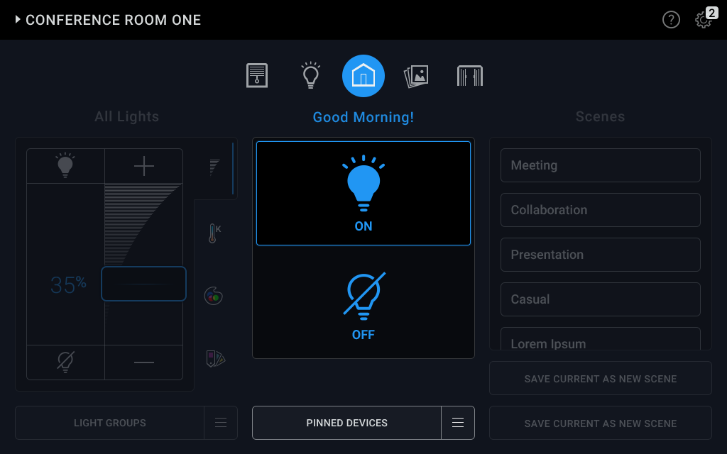
The final UI using my IA/IX, and painted by a visual designer.
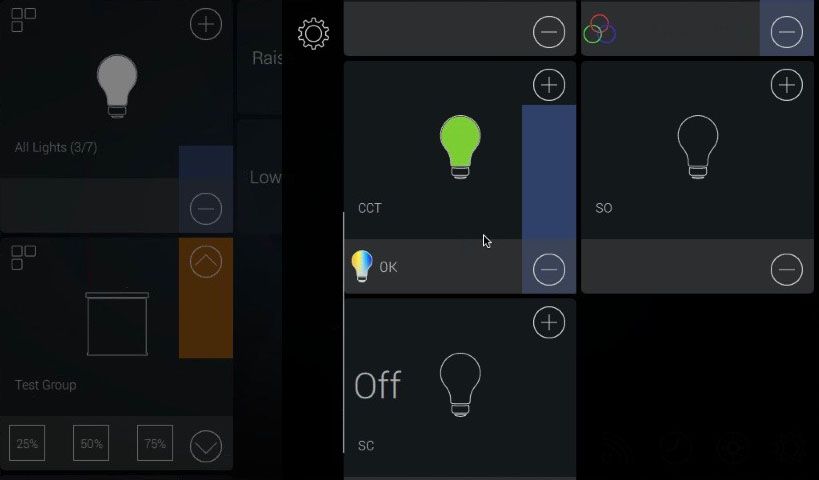
LeGrand's original smart lighting interface.
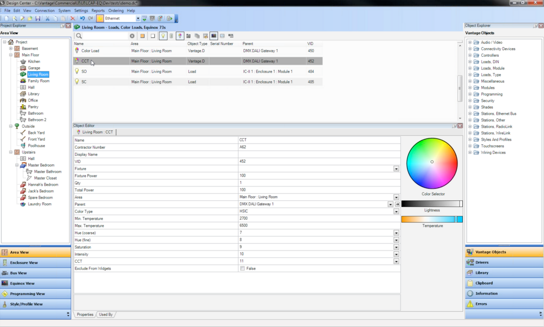
The original configuration tool interface.
Research
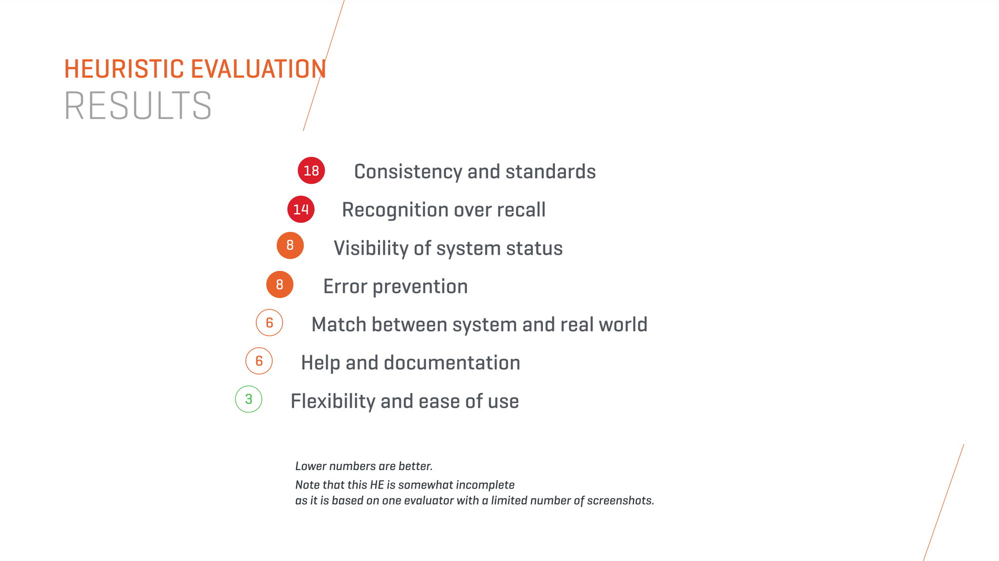
I started by using Neilsen Norman Group's basic categories for Heuristic Evaluations and applying them to the existing interface.
The client already had a rich set of quantitative research to work from. I conducted stakeholder interviews to talk through user goals and understand their needs. Many users would have to use the interface with no previous knowledge. Intuitiveness was critical.
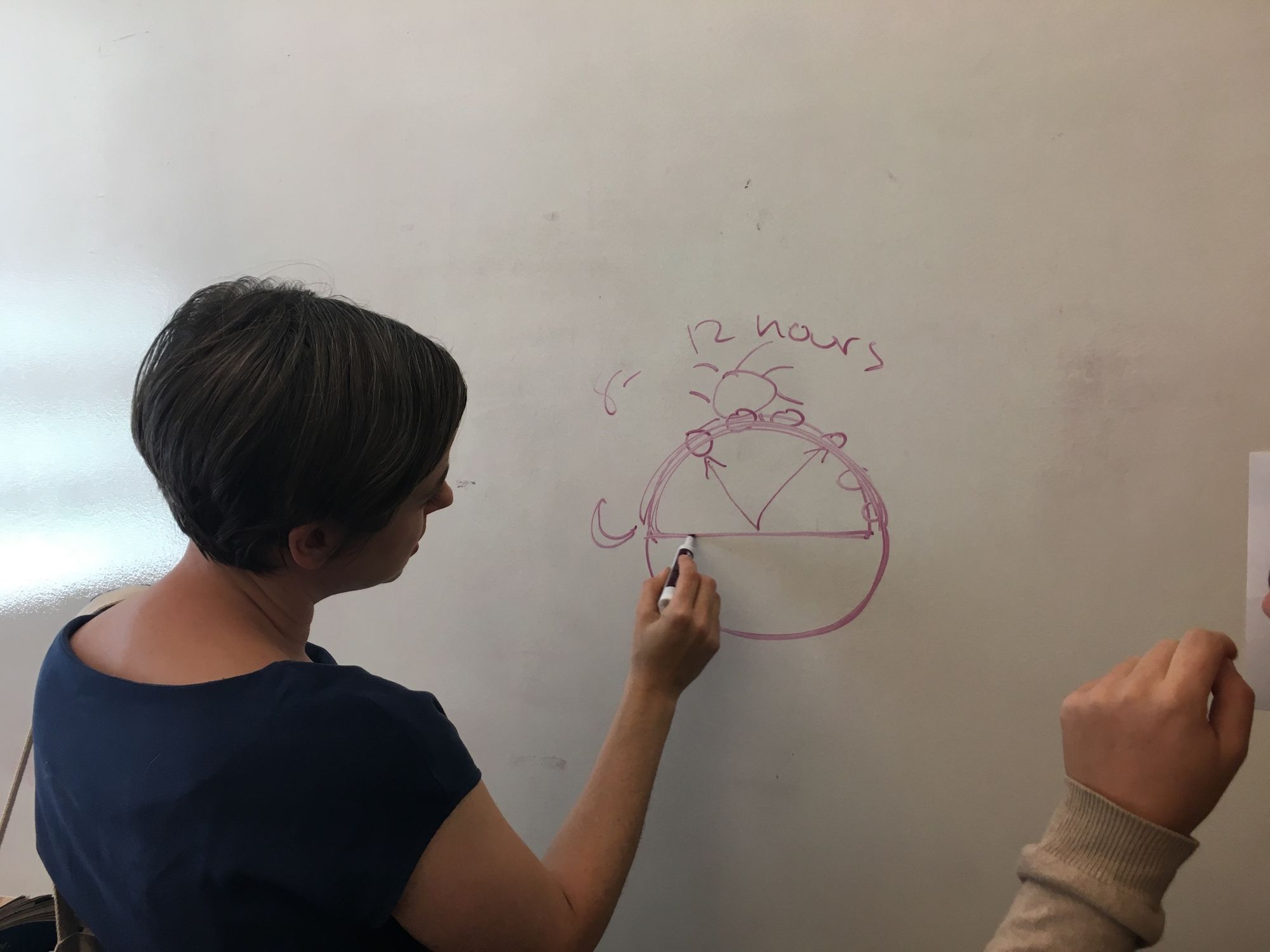
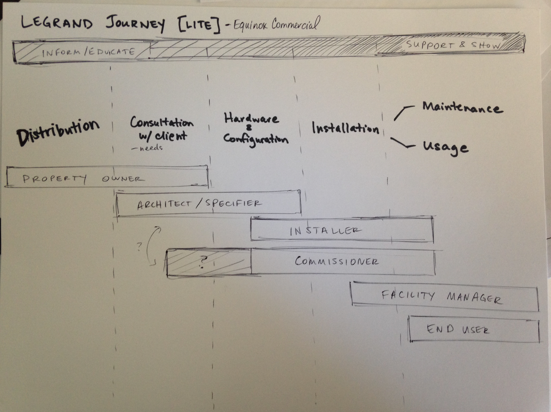
We then collaborated at the whiteboard to define work flows for different person types such as basic user, a building manager, and installer.
Definition
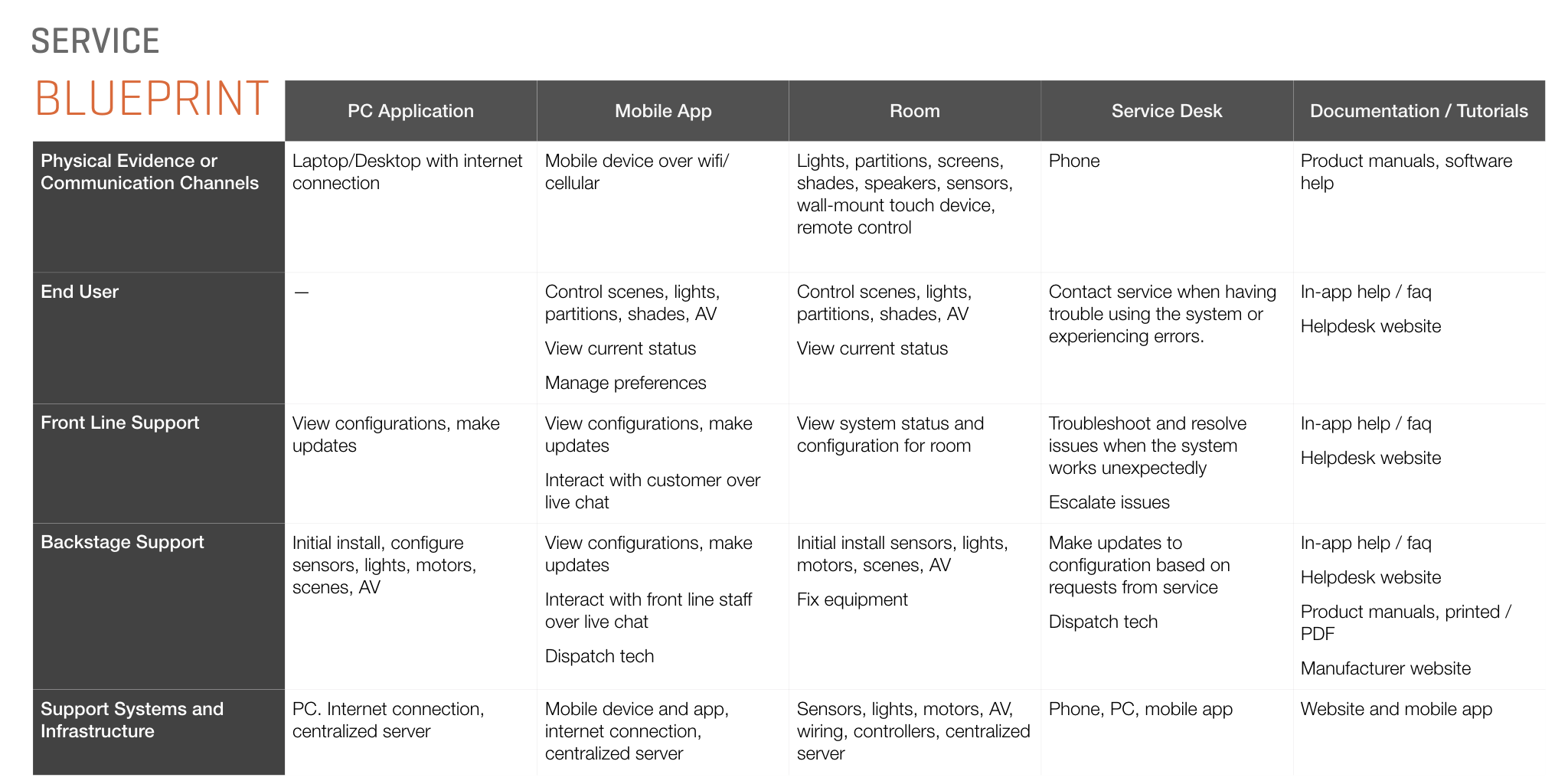
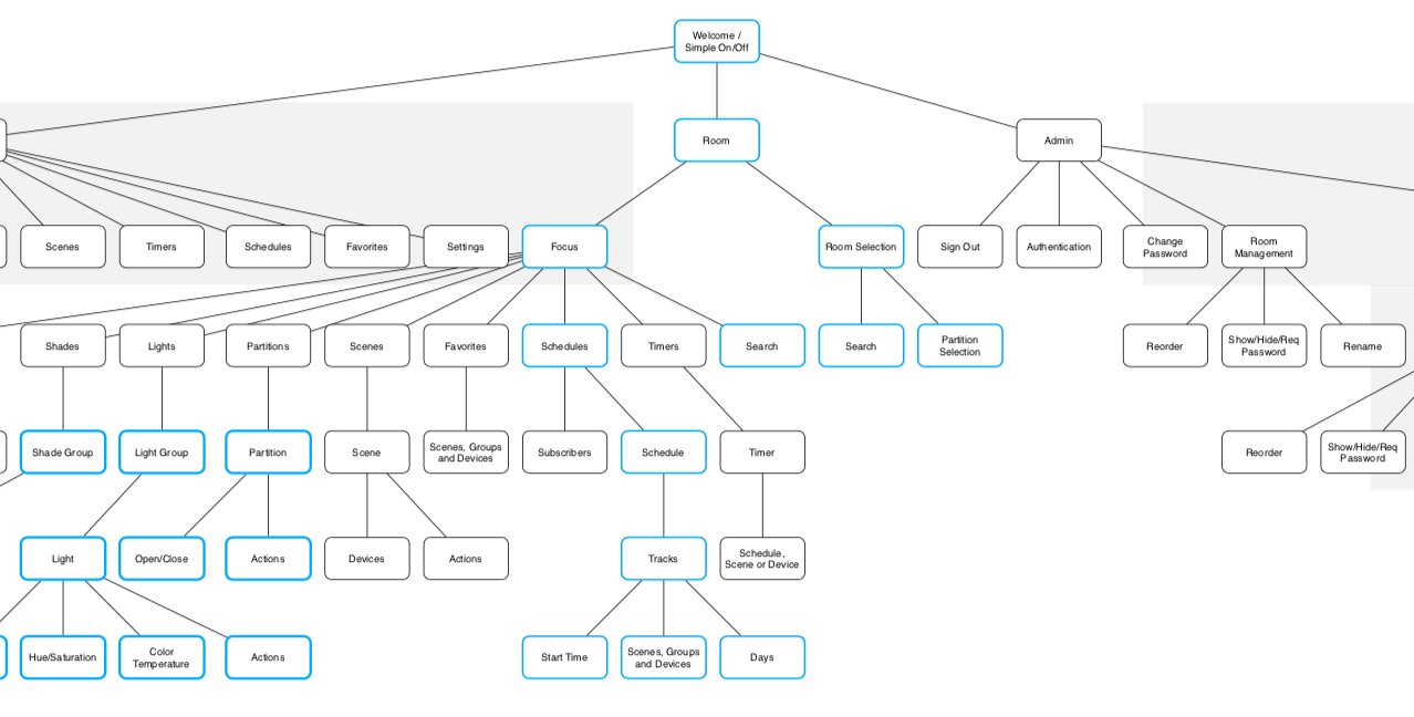
After creating a service blueprint to combine user goals and personas in a complete picture, I continued to explore the problem space by articulating a high level site map connecting the different screens necessary to support the flow.
I often find the easy way to start indexing my design tasks is to decompose flows into a set of specific user stories. I sized and prioritized the users stories, and iterated with the client to make sure we were in alignment.

Design
I quickly created generalized wireframes to get an understanding of the information architecture and to itemize the content needed on each screen. I did this for both of their hardware models, one of which was a vertical 4" screen, and a landscape 7" screen. I used Axure RP to build animations for transitions that would help the user understand the flow of the interface.
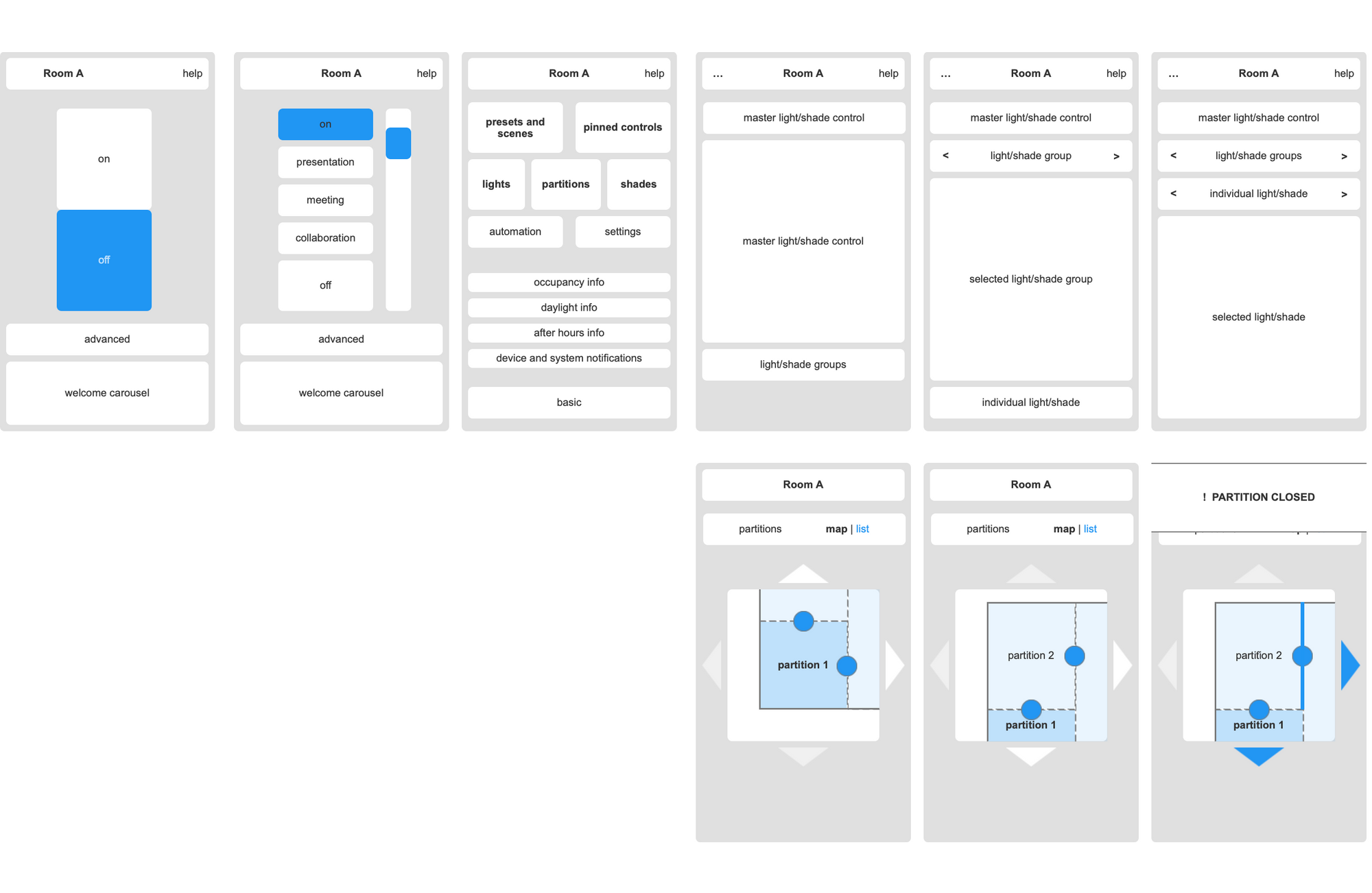
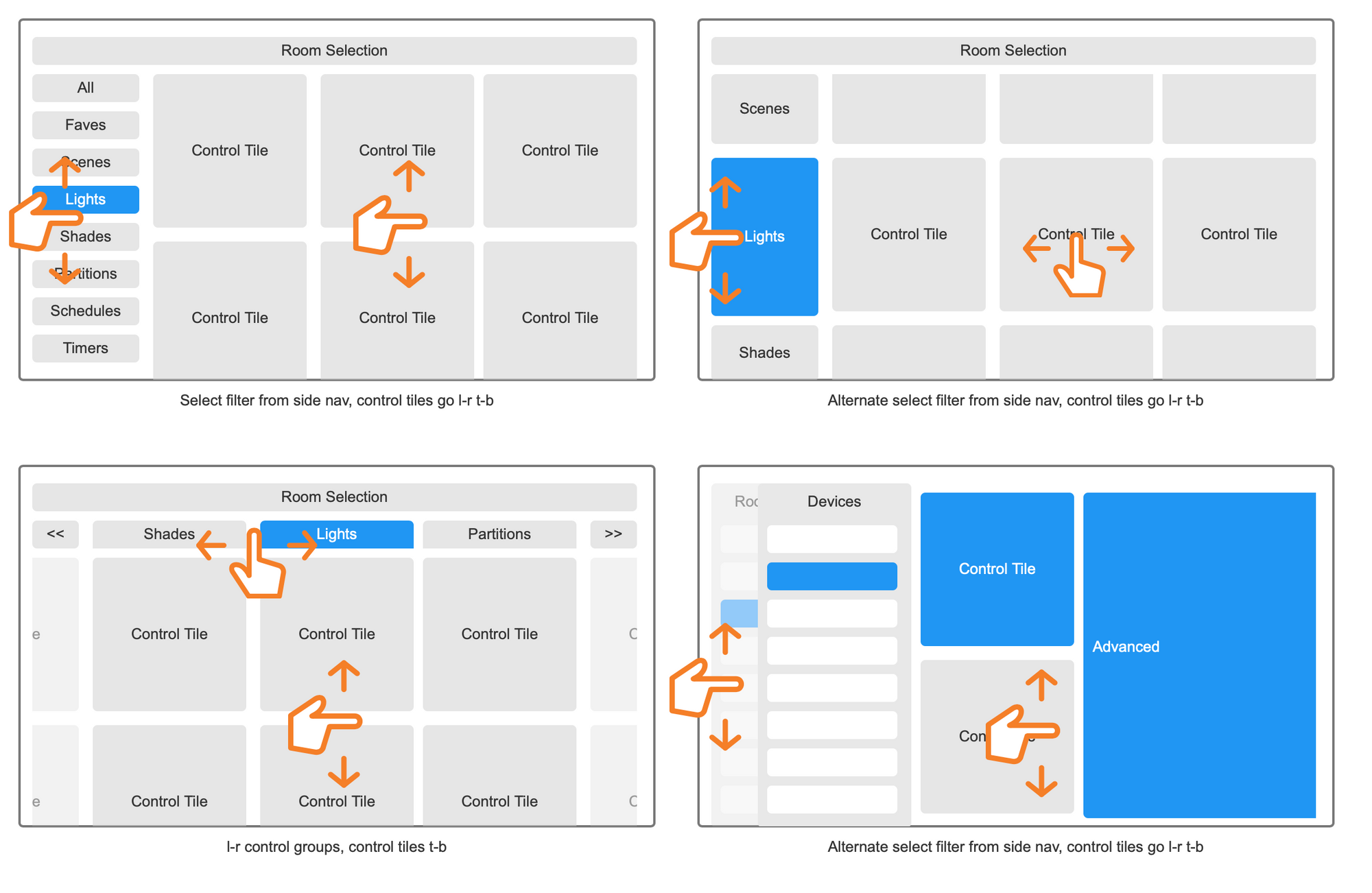
Once I showed the client the information architecture proposals, I dove deeper into the microinteractions of the interface. I used the principles of progressive disclosure to reveal more complex interface elements after presenting the user with the simplest interface possible.
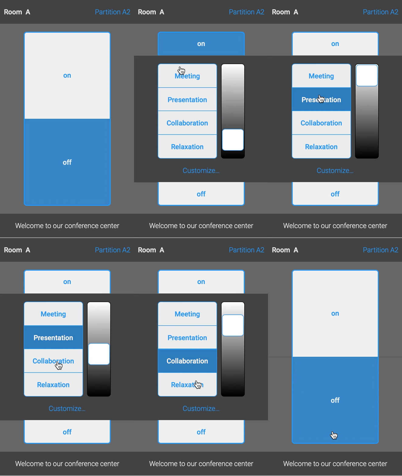
I continued to dive deeper into each screen interface, generating high-fidelity wireframes. Axure allowed me to model highly complex interactions which would be critical for our usability tests.
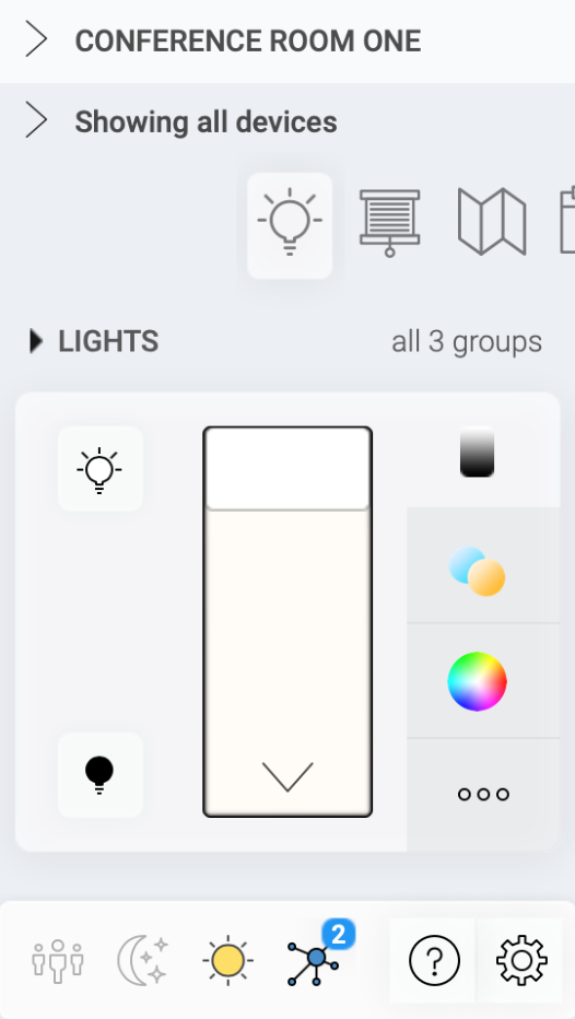
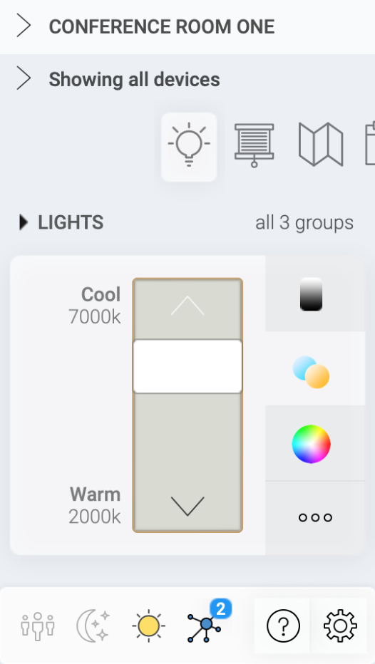
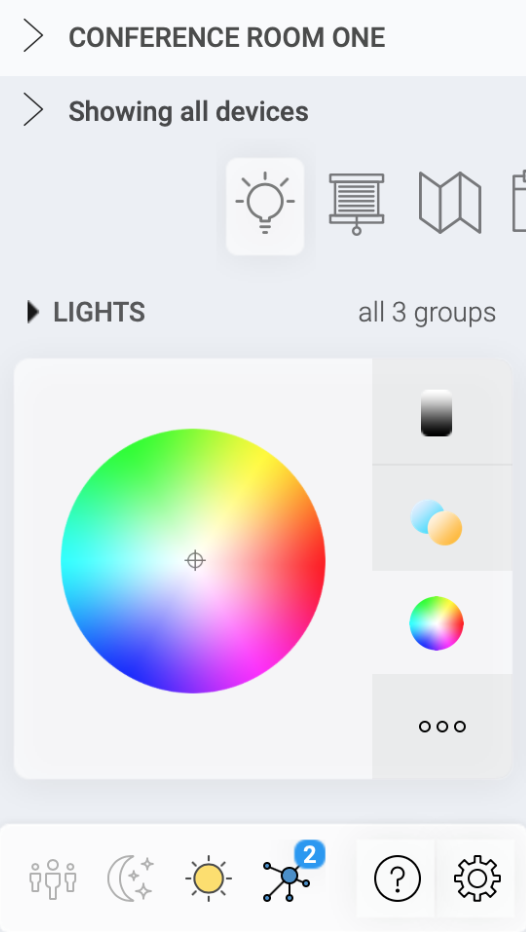
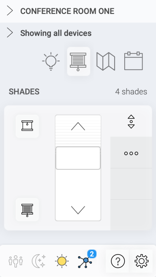
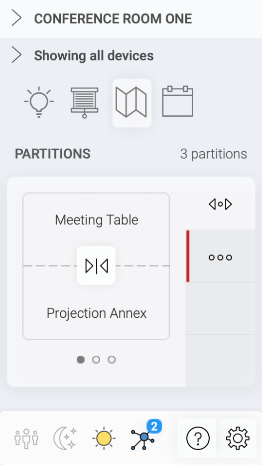
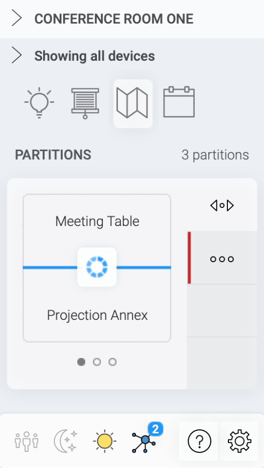
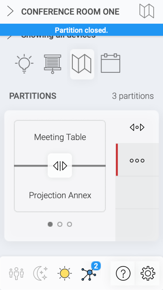
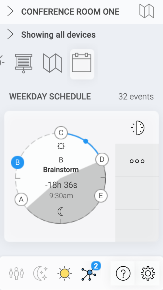
One of the most difficult challenges was porting the existing Windows configuration software into the 4" interface. The client was only expecting to be able to configure via the 7" screen, but I knew it was doable on the smaller size as well.
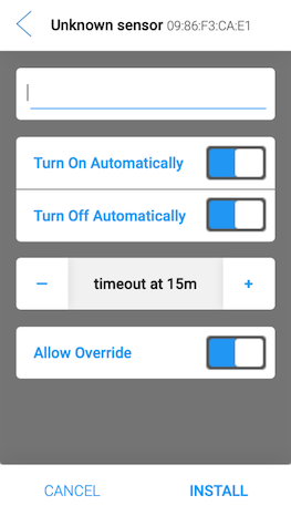
Prototyping
This movie shows the comprehensive level of interactions I was able to achieve in Axure. When I run usability tests, it's not enough to test a hero-path. I wanted users to be able to freely explore the entire system.
Usability Testing
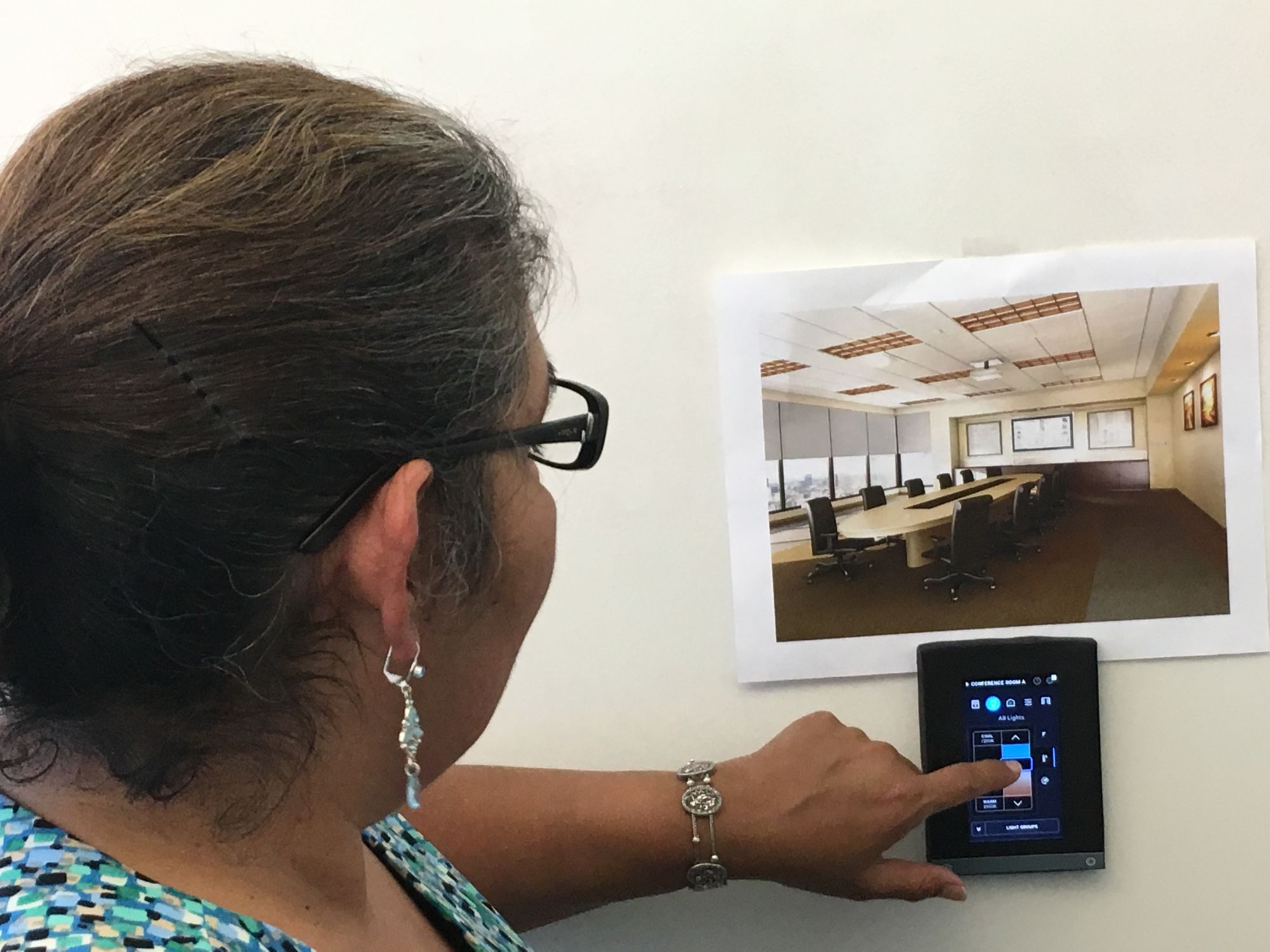
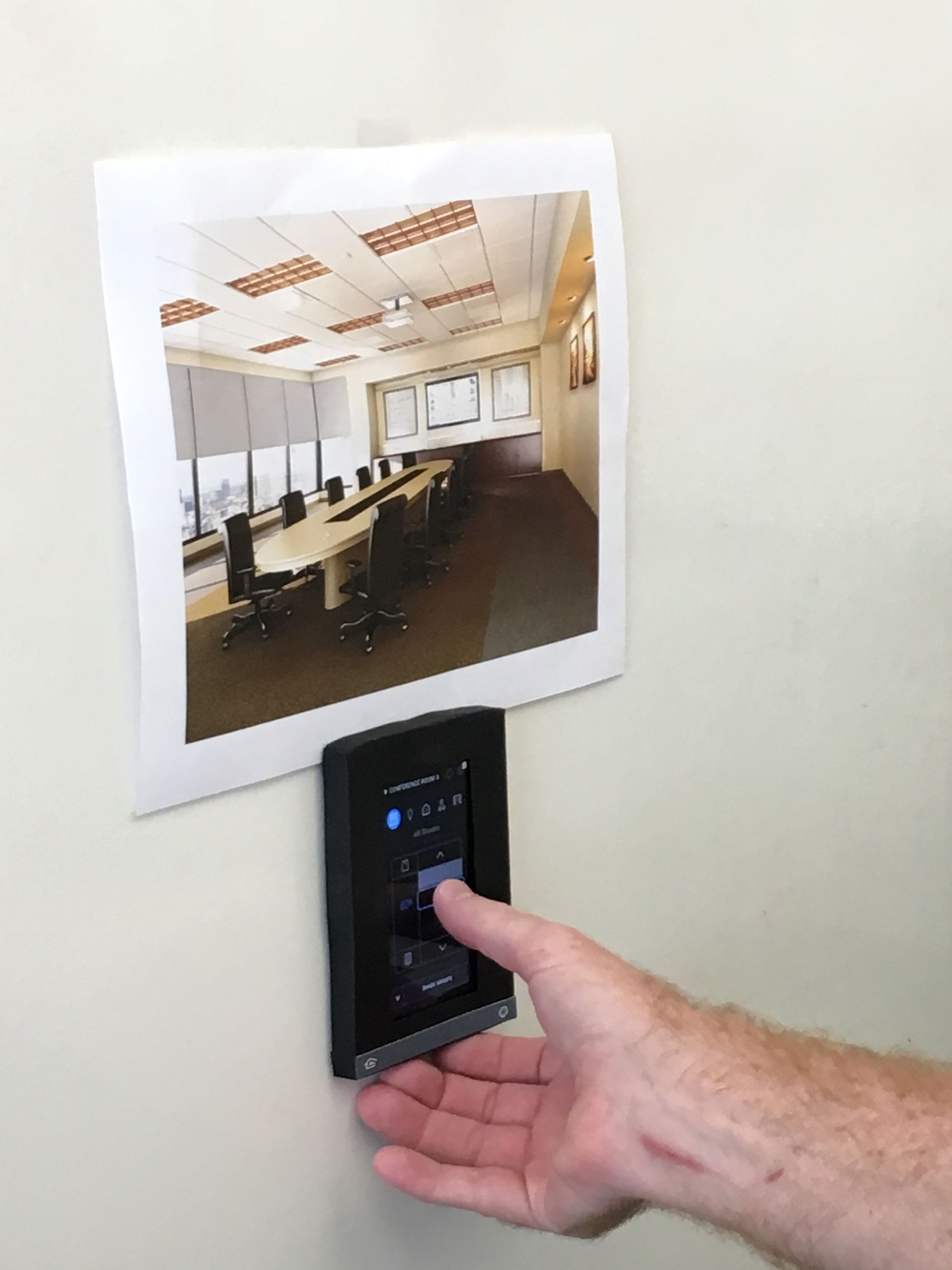
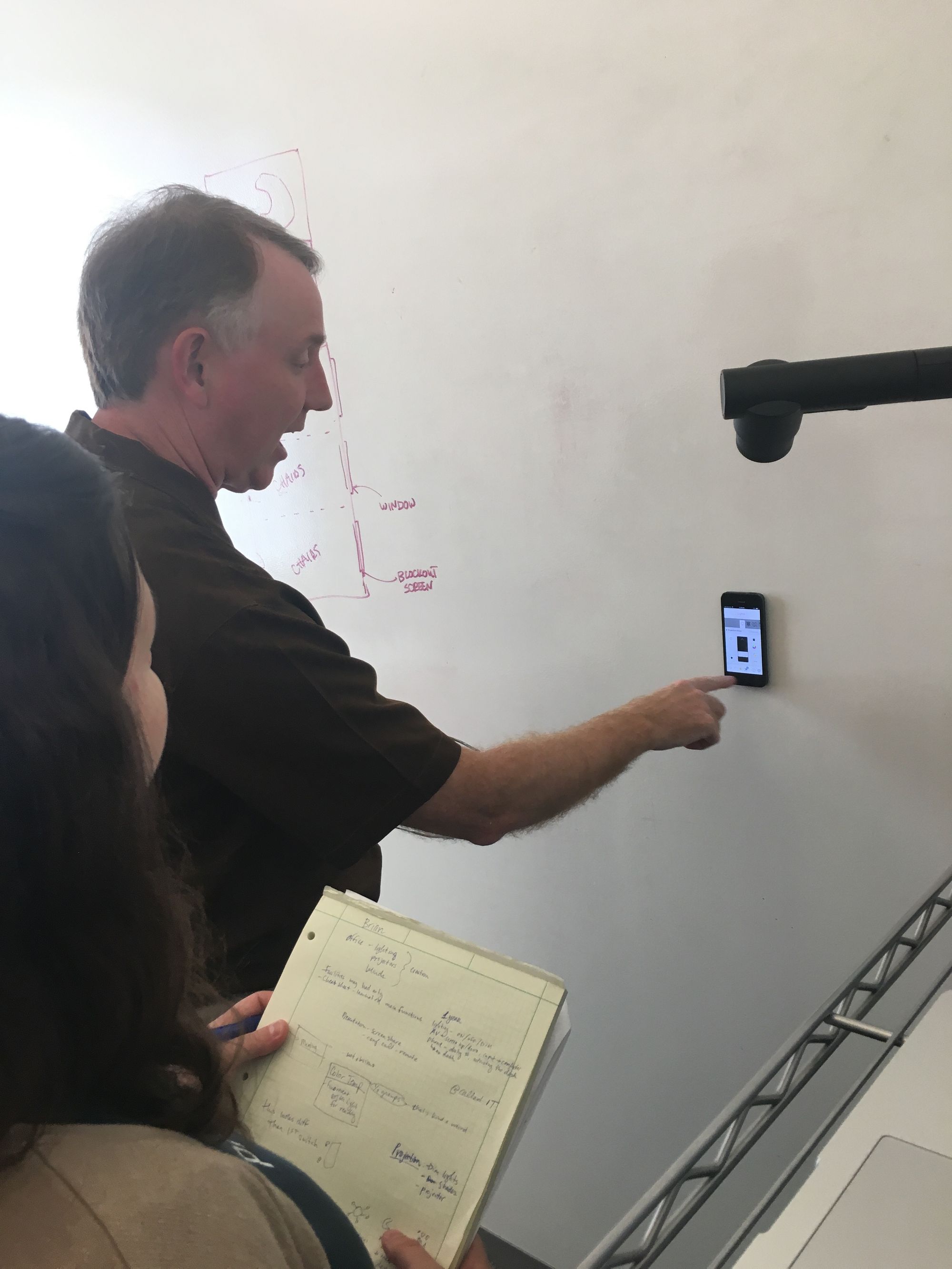
I worked with a usability researcher to write a test plan and protocol. Together, we observed seven users every session for a total of three sessions. I iterated on the design based on the results each time. By the end of the three rounds of testing and iteration, we were confident we had a system that would work for our users.
Visual Design
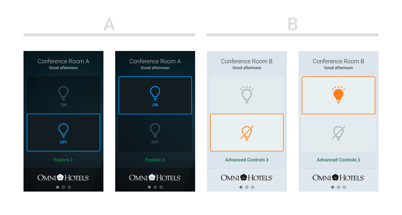
Once I had a good understanding of the interface architecture, we added a visual designer to the team. He refined the visual language, created dark and light modes, and created a secondary prototype in Invision to get user feedback on the aesthetic and readability of the design.

Results
We're very happy with the work that you did. It helped us accelerate our product launch. The only downside is we scrapped 7 months of our prior work based on your user studies!
No joke, it used to take 60-80 hours of custom programming to set up a simple room. With your interface changes, we've cut that down to 20 minutes.
The interface is intuitive to the people for whom it matters most.