Overview
Challenge
Digi-Key wanted us to compare usability metrics for both their live US-based and Ireland-based sites, in addition to two brand new prototype designs, to see which features and interactions helped users be most successful at finding electronic parts and placing their orders.
My Role
I worked with a usability expert to perform facilitated on-site and remote tests. These tests included talk-out-loud protocols. I also ran un-facilitated tests to increase our user reach. I performed statistical analyses, compiled a video highlight reel, and designed (and wrote some of) the final report.
Process
We scheduled 24 on-site tests, 24 remote tests, and 75 un-facilitated on-line tests. We compiled verbal and written user feedback, survey results, and performed a heuristic evaluation as well as statistical and click-path analyses on data collected by UserZoom. Additionally we compiled two video highlight reels from the on-site and remote tests, as well as providing a 200-page technical analysis of our findings.
Analysis
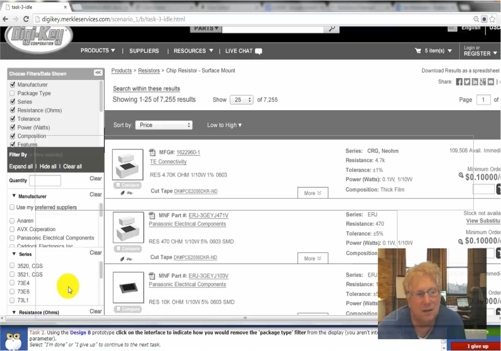
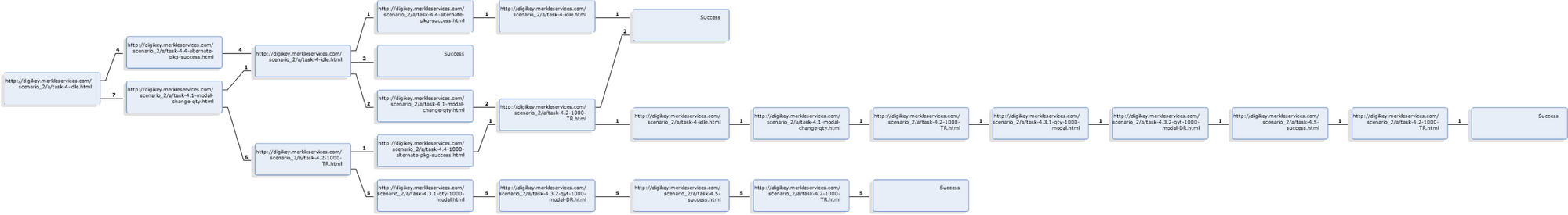
The UserZoom software provided detailed click-paths for each test with a count of users who took those paths. Because of the way our UZ representative configured the test, we had to clean up a lot of the data. In the end, we had to manually tabulate clicks and success rates within Excel. Ultimately this data allowed us to give recommendations to the client about which features were under-utilized, what users preferred, and where they were missing more efficient paths.
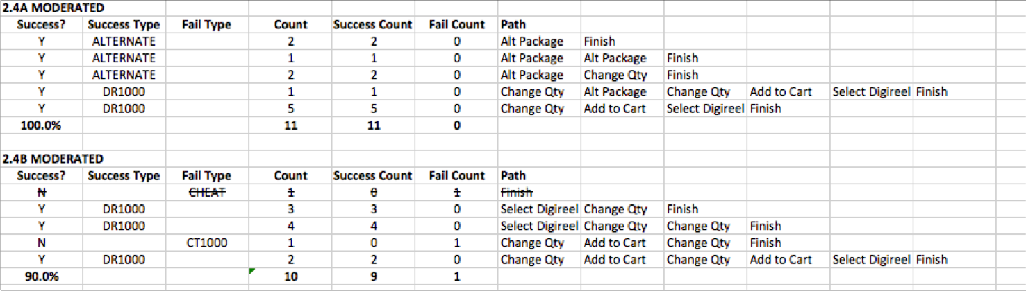
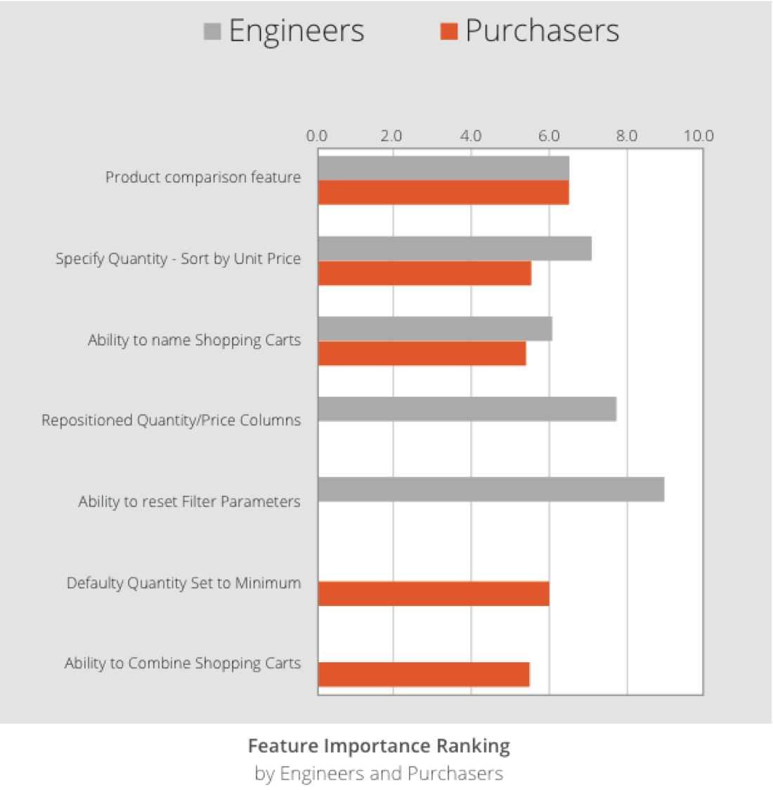
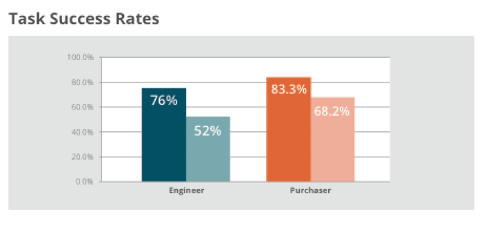
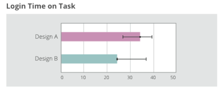
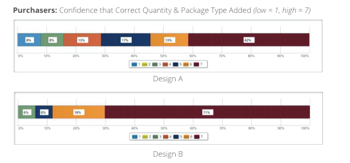
In order to be technically rigorous, I built a spreadsheet to calculate confidence intervals for various types of data such as time, successes versus failures, and survey data. We were most interested in time on task compared to success rates. We sometimes combined success rates with user self-assessment. For example, in the two bottom-left diagrams, we can tell that purchasers feel more confident using the second design to add items to their cart, however their actual success rate for selecting the right packaging is lower.
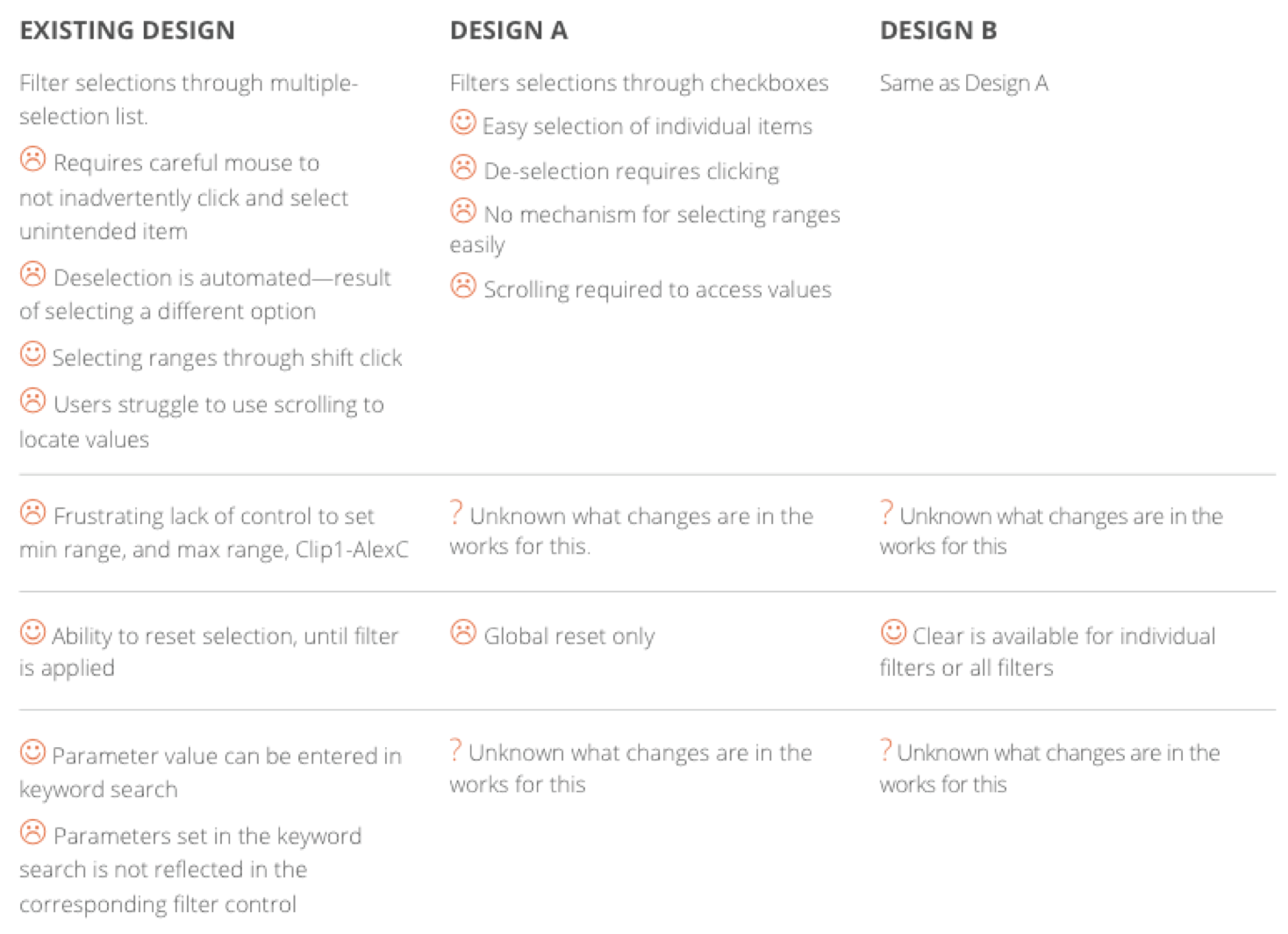
Based on statistical data, our observations, heuristic evaluations, and abductive reasoning, we came up lists of problem areas for each task as well as making recommendations on how each problem could be fixed.
Findings
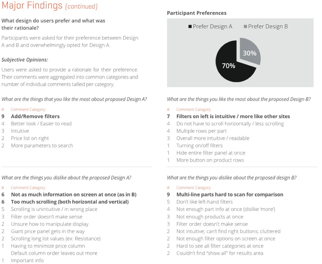
Throughout the testing process, participants were polled for design preferences and asked to justify their preference. Not only were we able to provide clear preferences for each user group, we were able to articulate what made elements in each design work better for users. Ultimately Digi-Key will be able to use this to combine the best aspects of both designs into a more intuitive, unified interface.
Outcomes
I delivered a final presentation to Digi-Key executives who were pleased with the work and relieved to see the “unknowable” become “knowable.” However, after my involvement ended there, I did not hear from our account manager on how Digi-Key planned to proceed.
The prototype designs were made by a contractor hired by Digi-Key. A majority of the issues we surfaced could have been discovered early on by testing paper prototypes with a handful of users. Failing to test early and often created a situation where, in addition to spending a large sum on usability testing, they needed to majorly rework their designs.