Overview
Goal
A large computer manufacturer of enterprise level hardware asked our agency, projekt202, to help them research issues faced by their enterprise technical support agents and design a new platform to help them debug customer issues.
My role
I led a team of three designers in sketching, designing, and prototyping user interfaces for the product. Additionally I wrote personas and scenarios based on the research. I performed usability testing throughout the design process, and I worked with developers to implement the final product.
What we did
We interviewed over 50 agents at the company. We synthesized this information into key design principles and opportunities. We followed up with a design phase that included sketching potential screens for the application, moving into wireframes, then a clickable prototype, and finally applying visual design. Throughout the process we employed user validation testing to get feedback on the efficacy of the designs.
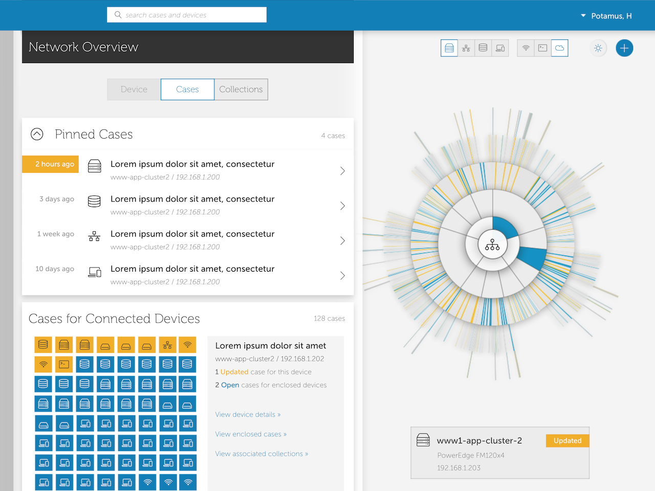
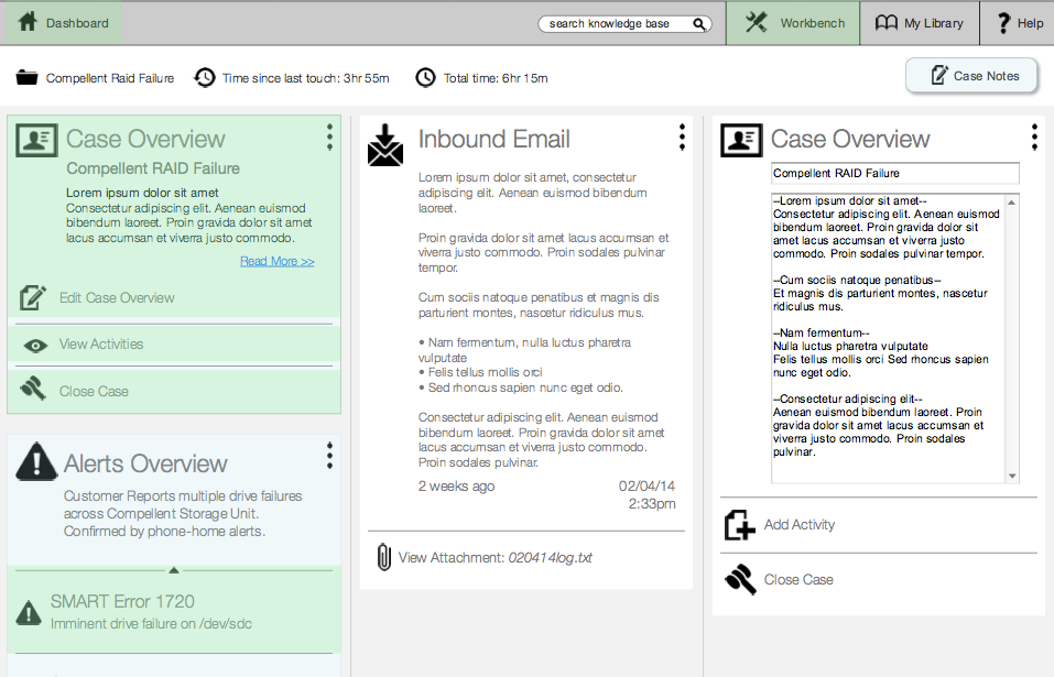
Visual design concept for final product, developed by me.
Research
Identifying the problems
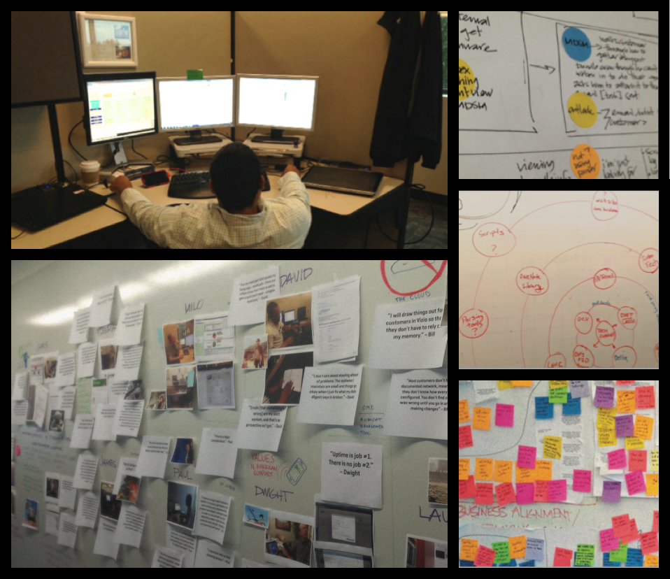
Our studies consisted primarily of contextual inquiries, an ethnographic technique for watching and interviewing people in situ. Through this we learned what tools and processes agents currently used. We generated task flows to find break points and areas of improvement.
Synthesis
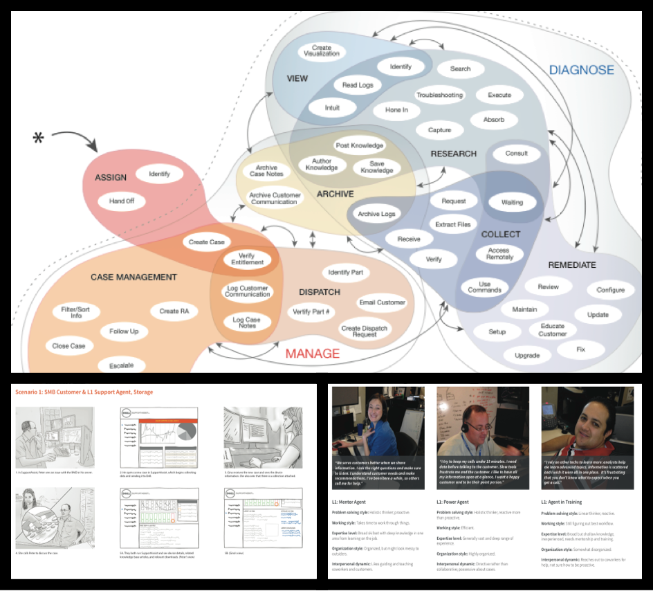
Personas
Using the information from our research, I was able to construct several archetypes to help us focus on the key design constraints. For example, we had to accommodate power users, new trainees, and different work modes such as linear or holistic debugging.
Scenarios
By watching videos of the interviews, I was able to construct eight key path scenarios that described most of the functionality of the ideal product. I lined up the scenarios with persona types, existing applications, and the lines of business that would be impacted. Before starting interaction design, we broke the scenarios into screens and user stories to guide us in the sketching process.
Storyboards
From the key path scenarios, I worked with an illustrator to create storyboards for each one. The storyboards proved critical in selling the idea to upper management who were primarily executives who did not have time to read through the detailed scenarios.
Ideation
Rapid Sketching
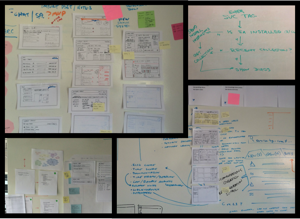
In the first week of interaction design, we quickly generated as many sketches as possible in 10 minute cycles. After each cycle, the other two interaction designers and myself would post our work and quickly critique each other. We’d then iterate over several rounds, each time integrating feedback and each other’s concepts.
Design
Wireframing and Prototyping
After the first rounds of sketching, we settled on a design language I created based on inspiration from Google Now’s card layout. The leftmost column would provide high level case information and actions. Each time an action was taken, details and editable cards would appear in the column to the right.
User validation and conceptual testing
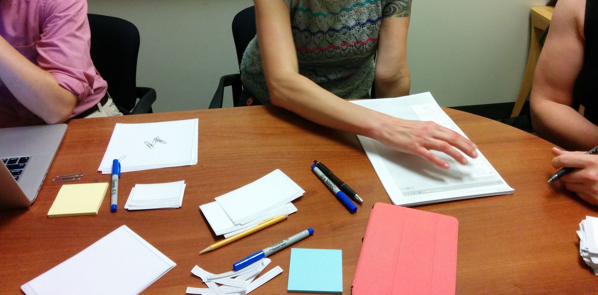
Even though we made the first set of Axure wireframes clickable, we decided to use a paper prototype so that we could run a more participatory session. When working with support agents, we gave them index cards where they could write down the content they would want to see, then place it on the page where they’d expect to see it. For future sessions, we used the Axure clickable prototype on a standard issue Dell laptop.
Problem solving
We ran a total of eight user validation studies. Each time we’d see four participants for about 45 minutes each. A typical weekly schedule would be wireframe Monday and Tuesday, prep for testing on Wednesday with dry-runs, test on Thursday, then externalize and synthesize user feedback on Friday.
At the beginning, users pointed out glaring flaws in navigation and the card-based paradigm. By the sixth session, we were only getting minor feedback points and realized we were actually on to a great design. Overall we found the card paradigm too confusing for users, however, we found that by removing borders and placing the content on a larger canvas, users suddenly understood it. Additionally, we created a “poster” paradigm: content opens within in the same page, but in a poster area so that the user can keep relevant content manageable, but quickly switch contexts.
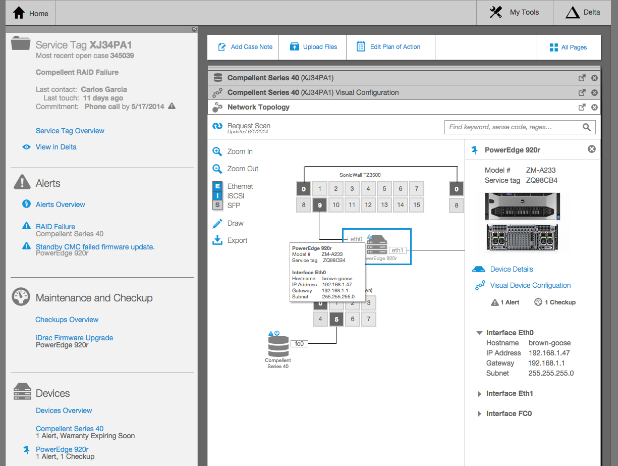
Highlights: Network Diagram
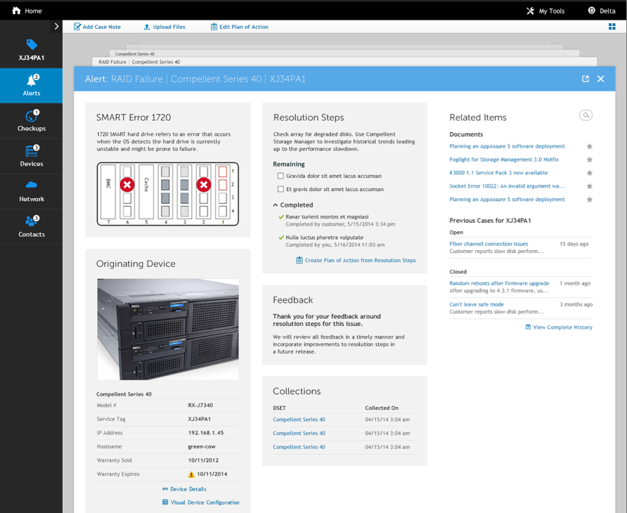
When debugging complex problems, support agents need a map of a customer’s network and how devices are connected. In this view, each device has a summary tool tip. Clicking on the device reveals a slide-in right panel with more information and actions that can be taken on the device. Network connections are automatically highlighted so that it’s easy to identify connections in complicated environments.
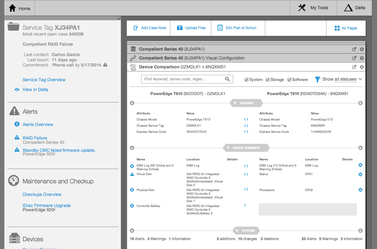
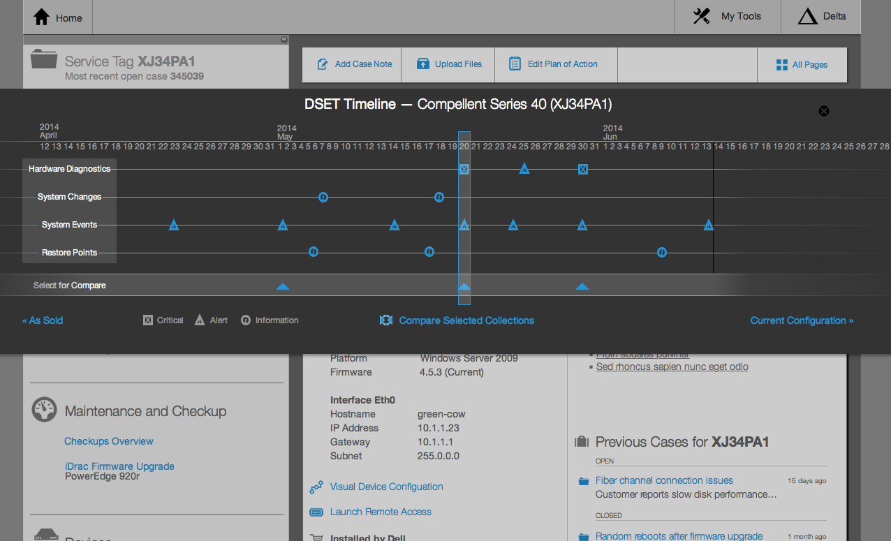
Highlights: Configuration Changes
Often problems can be solved simply by finding a configuration or hardware change on a device. In this history popup available for every device, a tech agent can quickly scroll left or right in a device’s history to locate system changes, alerts and restore points.
Customer environments often contain multiple deployments of a similar device configuration. When one device fails, the support agent can compare it to known-healthy devices to quickly find differences in system configurations and installed drivers and software.
Visual Design
Initial Product
This company already had an internal visual design language. We applied this to the wireframes, but it still required us to add new elements to their design language. We iterated over the visual designs several times to make sure every pixel was perfect.
Follow on Work
In future phases, I was assigned some of the visual design work. I was given more luxury to work outside of the existing design system. Here is one of the concepts I developed.
Results
Outcomes
The research we did for was socialized around the company and inspired groups outside of enterprise technical support to adopt similar design practices to look at their processes. When visual designs were presented by an executive to the support team, he received a standing ovation.
Lessons Learned
Test early, test often. In the first user test, we received such valuable critique and feedback. Had we waited until later in the design process, we would have had to throw out weeks of work. Instead, we were able to quickly make evolutionary changes, and by the time we reached a final design, everyone was confident we went in the right direction.
It’s not enough to have static wireframes. I designed several complex micro-interactions. How they worked was not obvious until I programmed them in Axure. Had we just made assumptions from static wireframes, we would have removed these features. However, by testing fully functional interactions, we were able to see how intuitive they were for users—and document it for those who had their doubts.