Overview
Goal
United Way for Greater Austin (UWATX) asked me to research donor online giving habits to supplement quantitative research they had done. While their market analysis provided insights into behavior and demographics, it didn’t explain why users behaved that way and what they wanted ideally.
My Role
I worked with assistants to conduct contextual inquiries and participatory interviews, and synthesized data with the UWATX marketing team. I wrote a final report summarizing key design pillars and provided a detailed scenario for an ideal system that met those requirements, as well as preliminary wireframes to express the concept.
What I Did
After scheduling participants, I worked with eight diverse users to discuss their giving habits and motivations. After transcribing all the interviews, the UWATX team and I organized all the data to create insights into these behaviors and how to encourage users to give more to non-profits and charitable organizations. Based on these insights, I developed designs to create a giving platform.
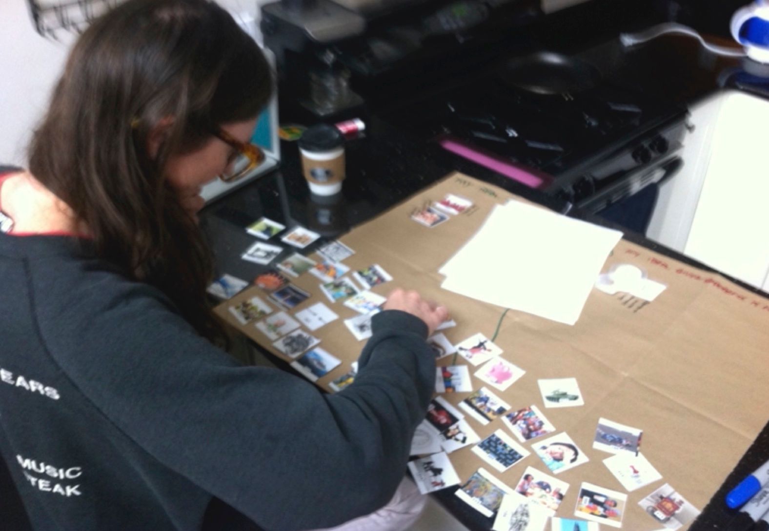
A participant sorts images during a participatory design exercise.
Research
Journaling
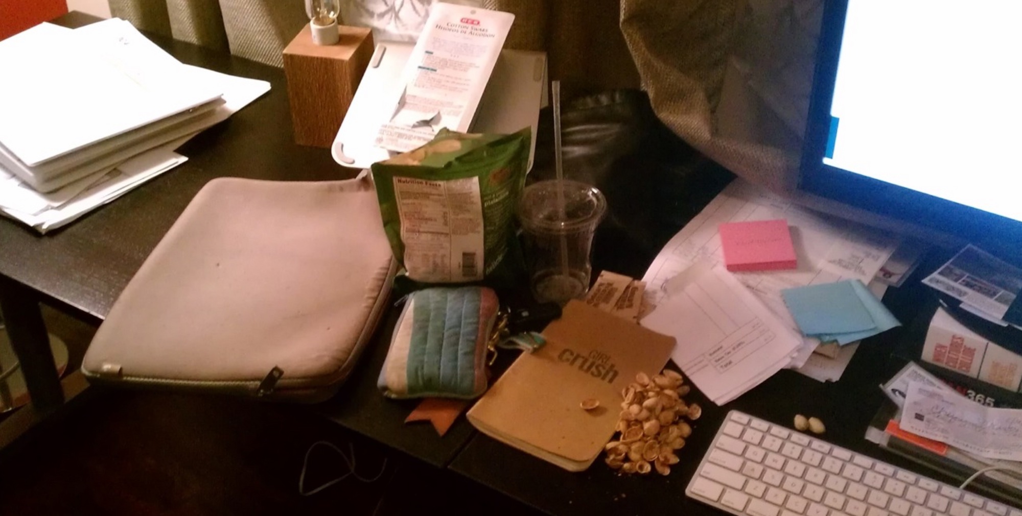
Before the in-person interview, I asked users to make a donation online and record aspects of their experience. I also had them take pictures of the process and their environment to get a feel where users tend to make their giving (home office, living room, etc).
Contextual Inquiry
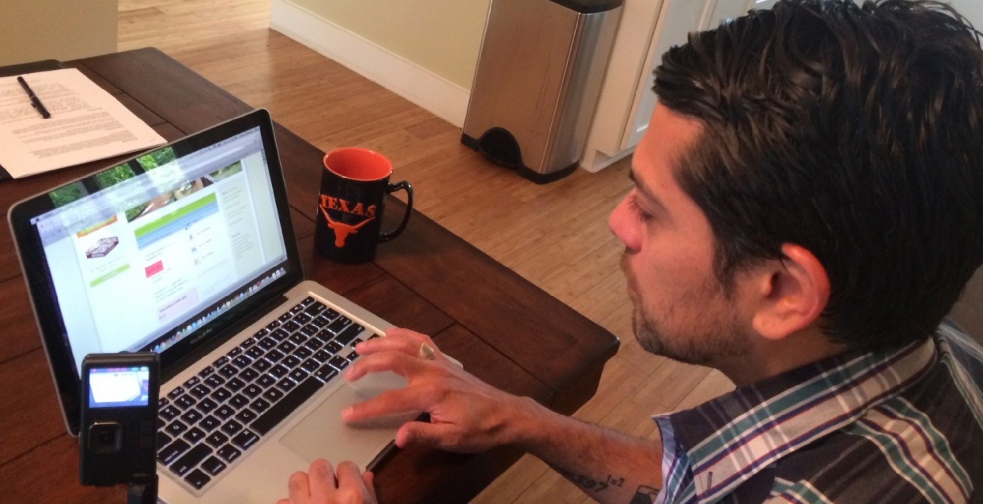
The study consisted primarily of contextual inquiries, an ethnographic technique for watching and interviewing people in situ. I asked users to pick a favorite non-profit and make an online donation. I documented their processes including what worked and areas of frustration. While performing the tasks, users and I would chat about their general views towards charitable giving.
Participatory Research
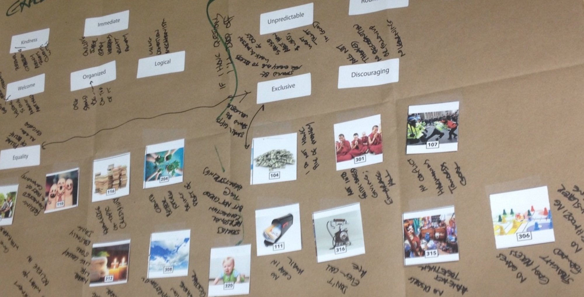
Because it’s difficult for many users to articulate their ideal experience (or dream state), I created a deck of stock photos for inspiration. Participants find images that speak to them (in terms of ideal and non-ideal experiences) and lay them out on a canvas. We then discuss why they chose those images, and I notate that on the canvas. This process helps users unleash their creativity and become part of the design process.
Synthesis
In order to be immersed in the data, I took over a room of my house to post all the canvases from the interviews. I then transcribed and printed over 1,000 individual statements made by the participants.
I invited three members of the UWATX team to join me in the synthesis process. We looked for statements that had similar themes and grouped them together. As we saw themes emerge, we’d write out a more generalized statement on a green card to summarize everything in that theme.
Over the three days that we synthesized data, we’d see new themes emerge, others would become less relevant, some of them merged, and some of them split into new groups.
Insights
Using the information and themes learned from the research, I presented a set of design principles focused on potential donors.
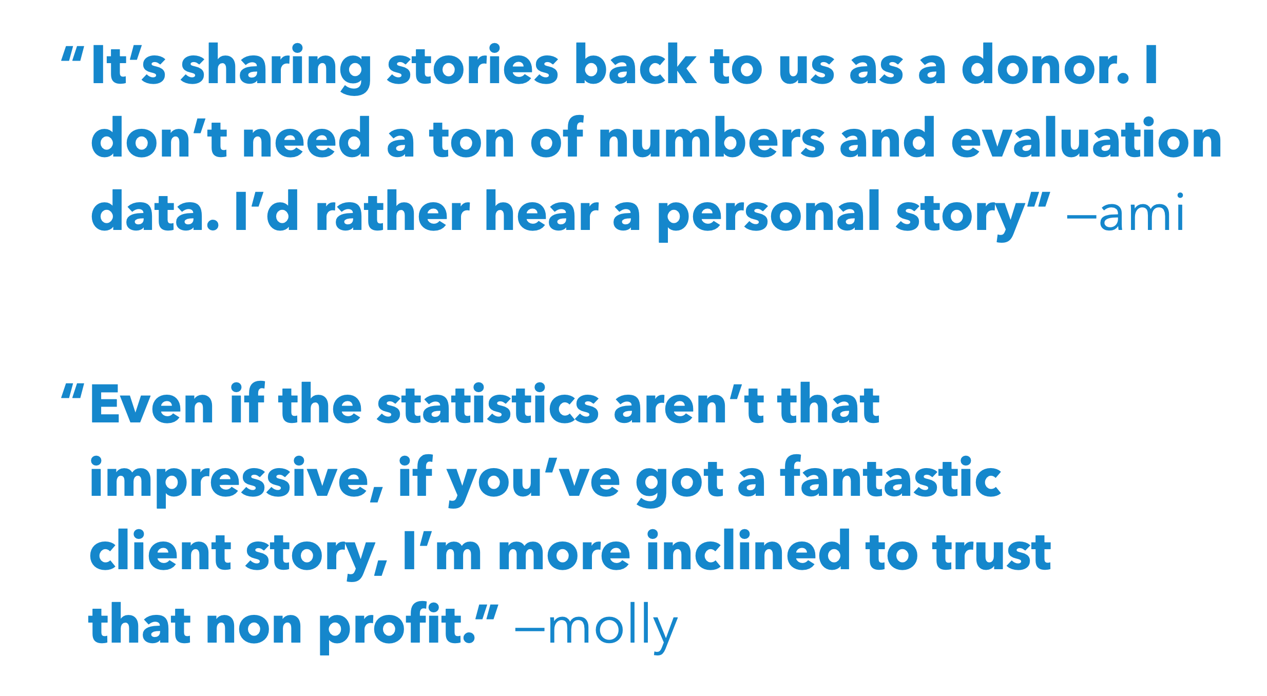
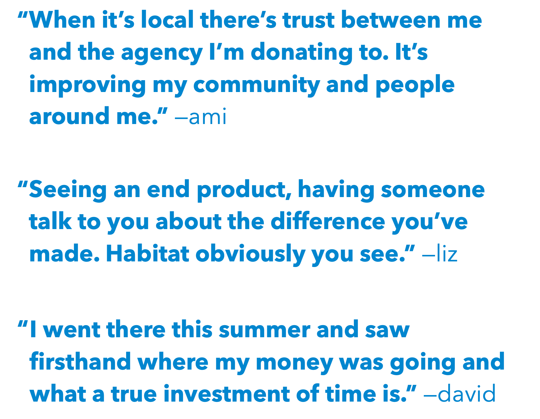
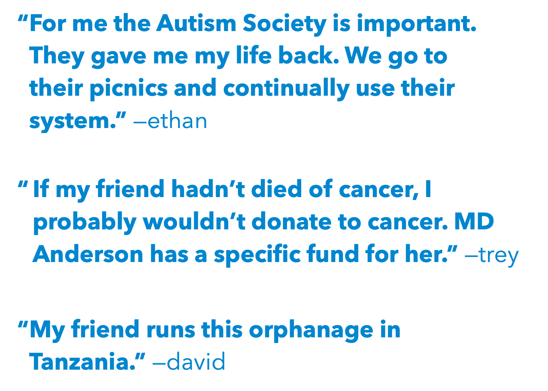
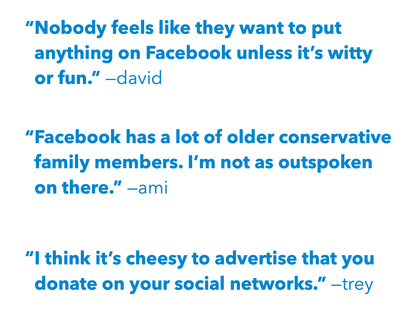
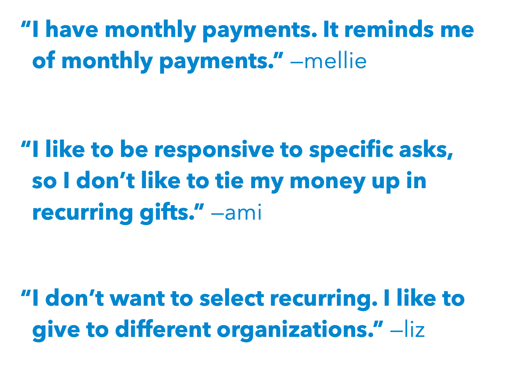
The quotes below demonstrate themes that emerged. From left-to-right, top-to-bottom, these quotes helped us answer certain hypotheses:
- What type of information helps donors decide to give? Qualitative? Quantitative? Stories and images resonated much more than statistics and infographics.
- Geographic proximity matters; most participants valued making an impact on their own communicites.
- Relationship proximity also matters; many people give regularly to organizations who have personally impacted their or their friends lives.
- United Way very much wanted to turn giving into a social experience, but donors felt the opposite way. Giving tends to be a private activity versus something like volunteering. Why? Lower-income donors worry about not contributing enough compared to their peers, whereas higher-income givers worry about showing class privilege. When volunteering, everyone can help in a much more equal manner.
- Finally, recurring donations are critical to steady cash flow, but donors are resistant. We had to remove the feeling of a monthly bill as well as provide flexibility for donors.
Design
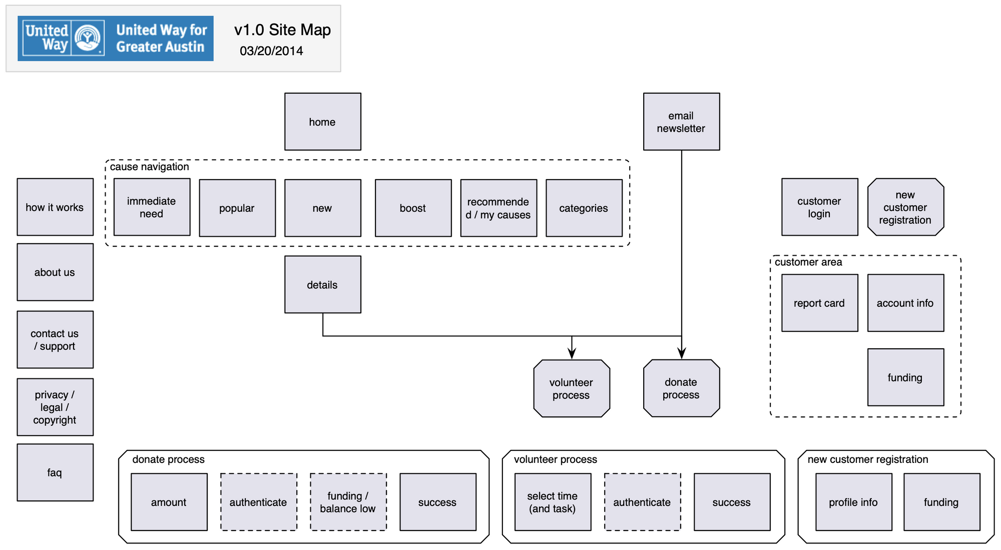
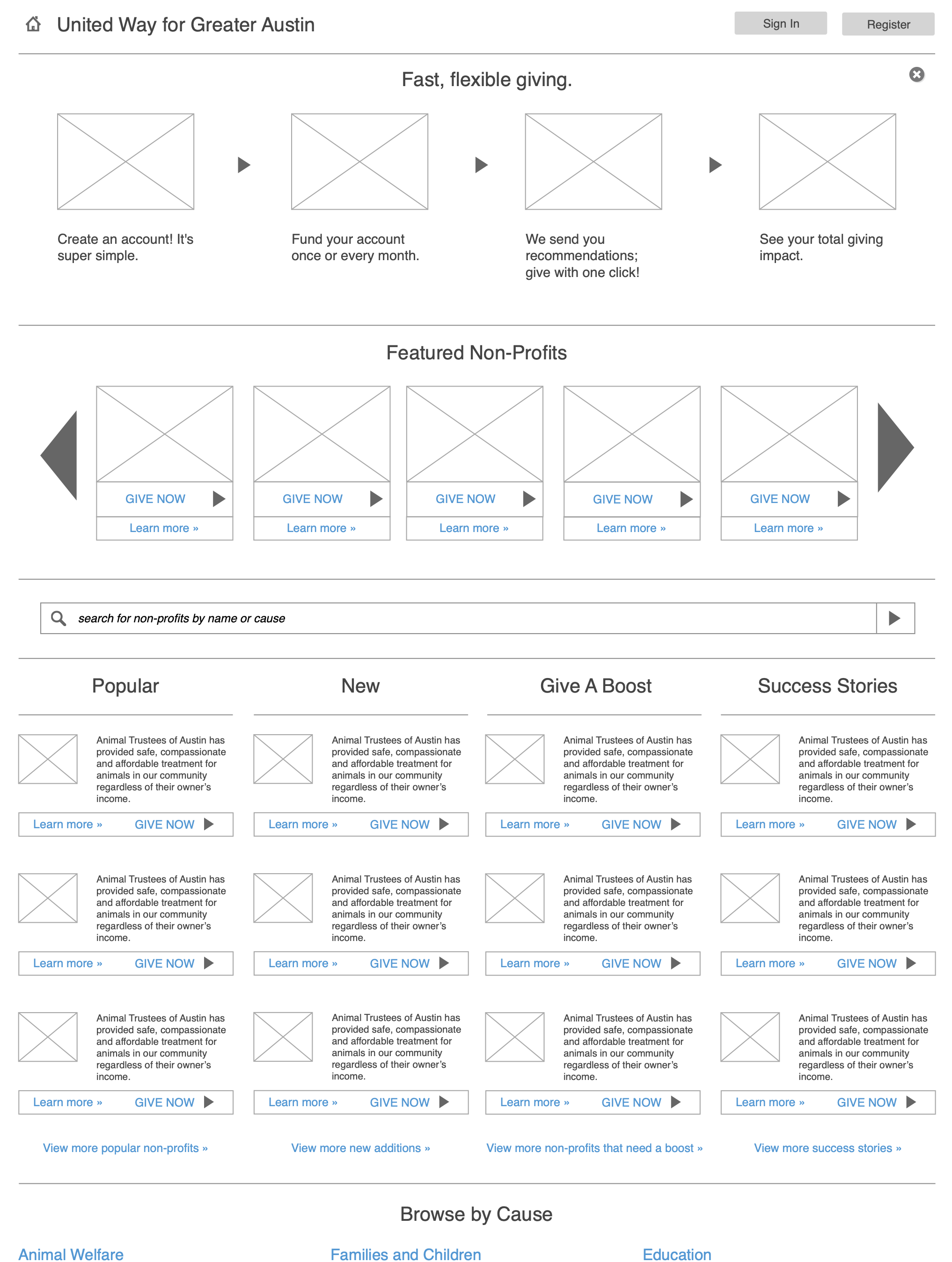
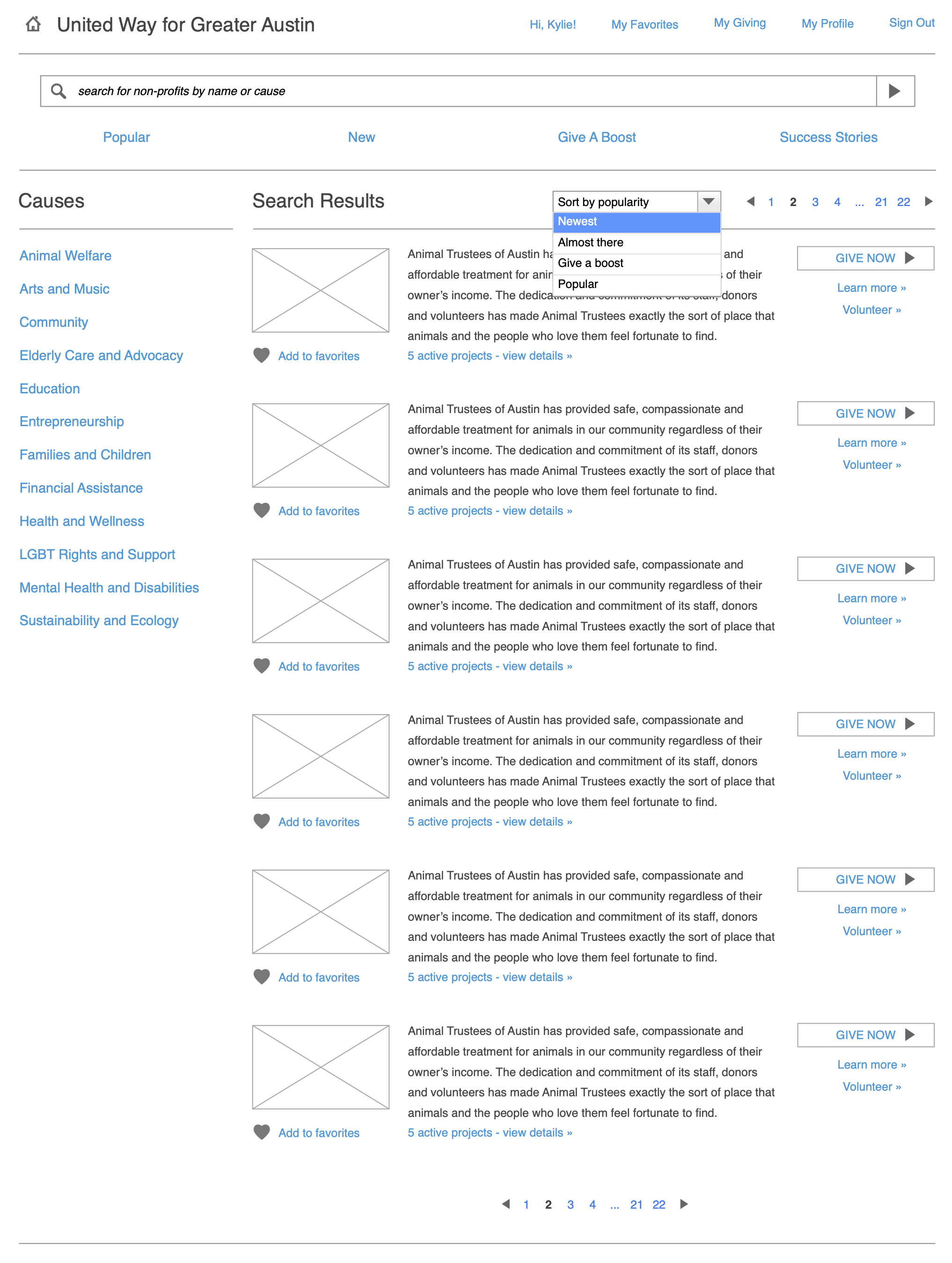
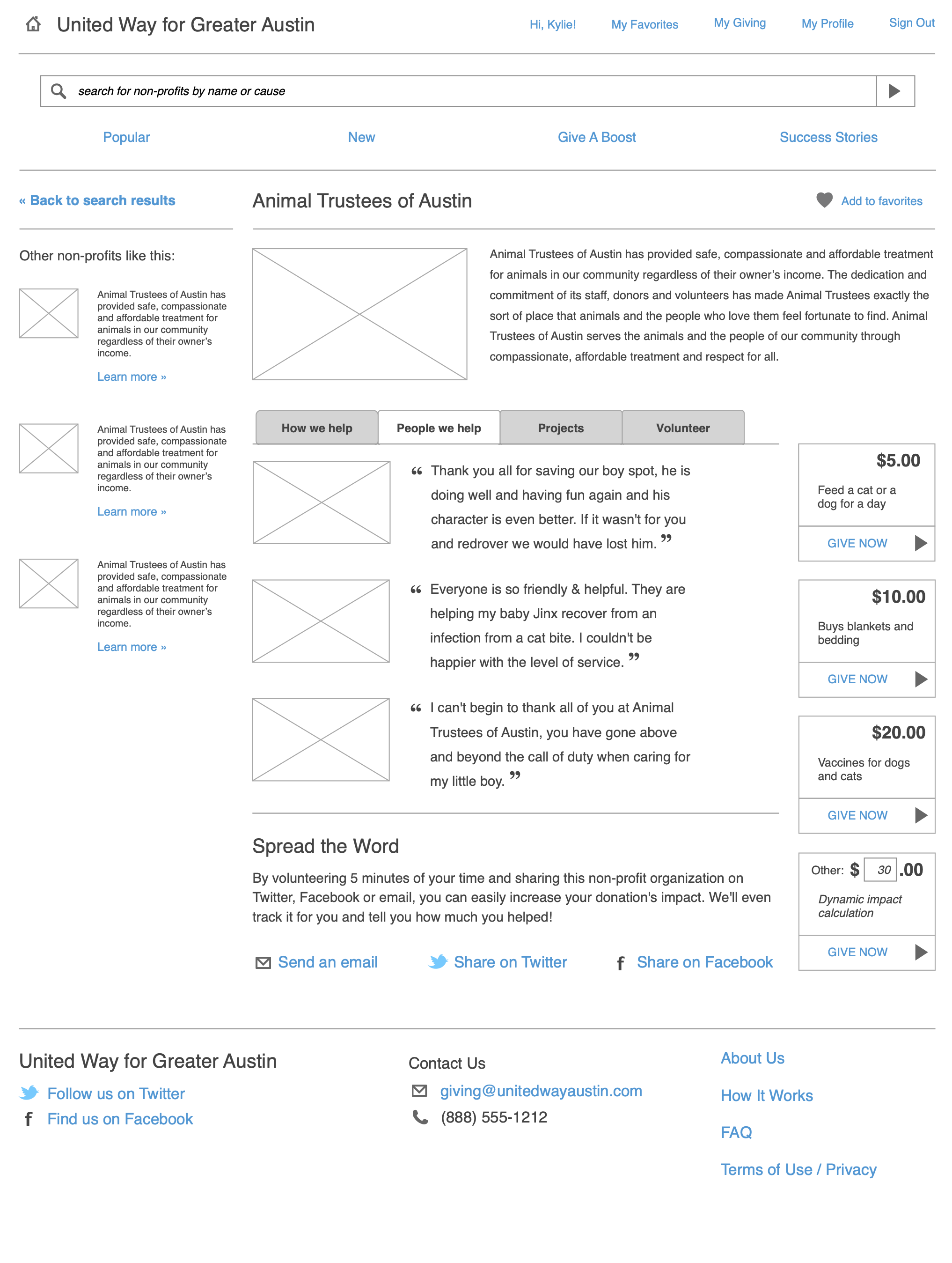
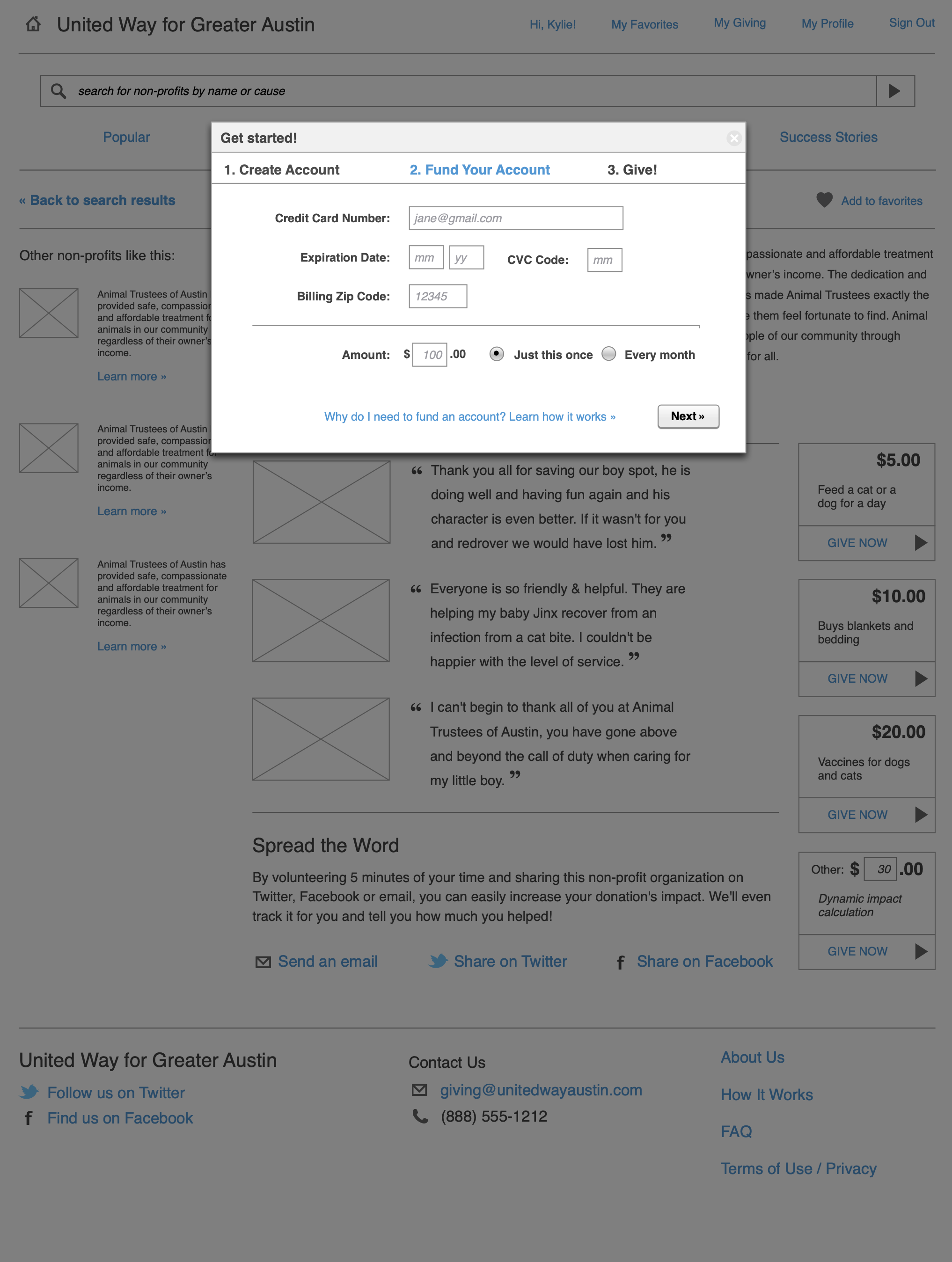
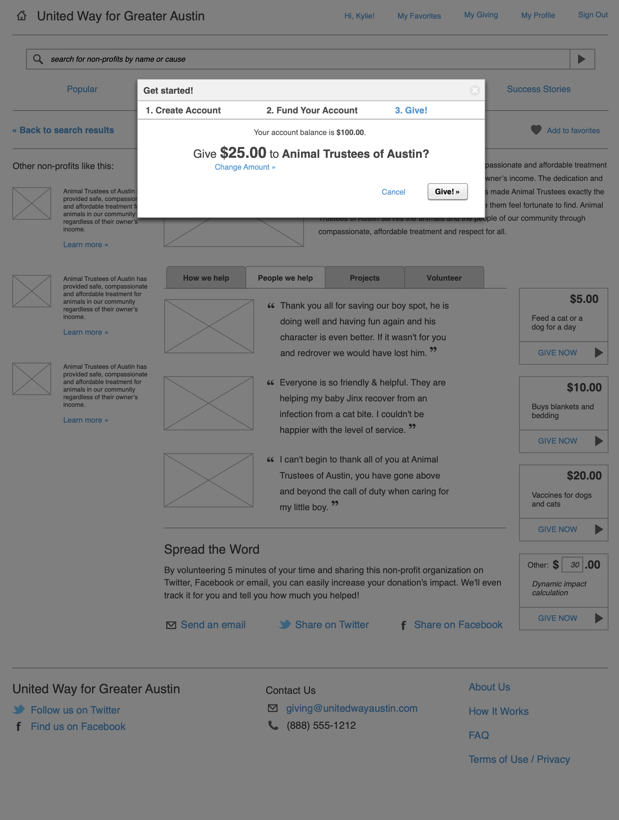
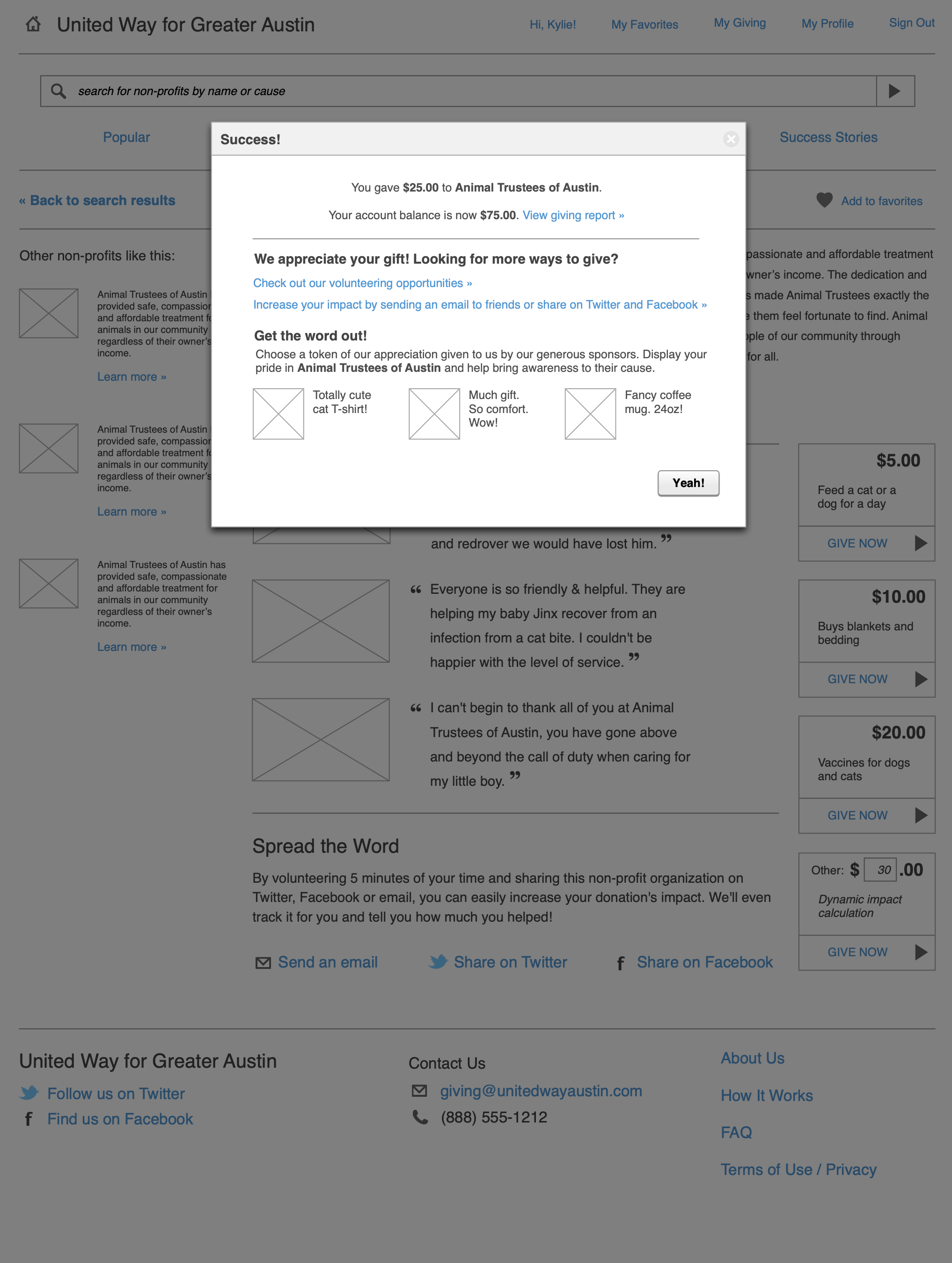
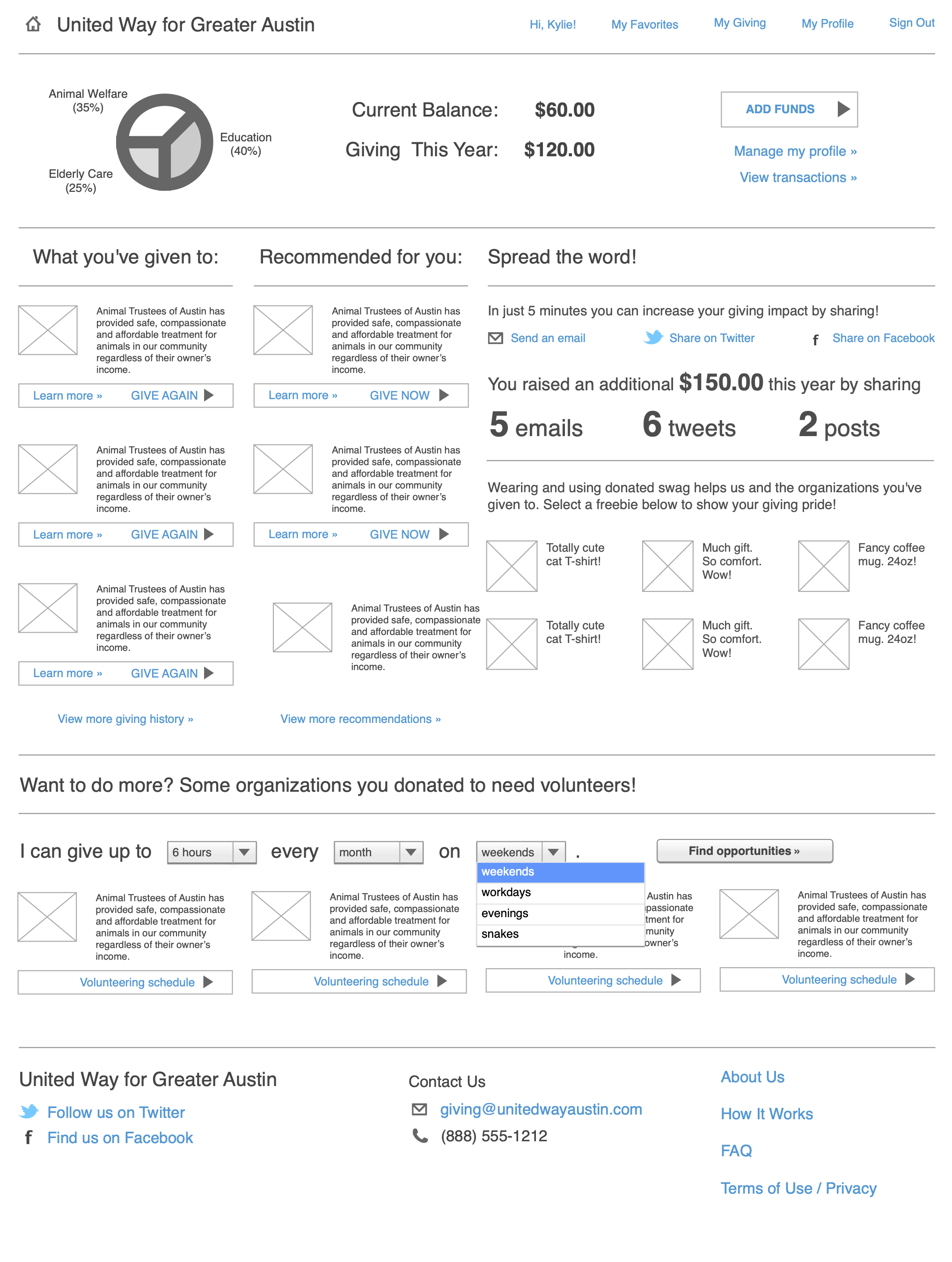
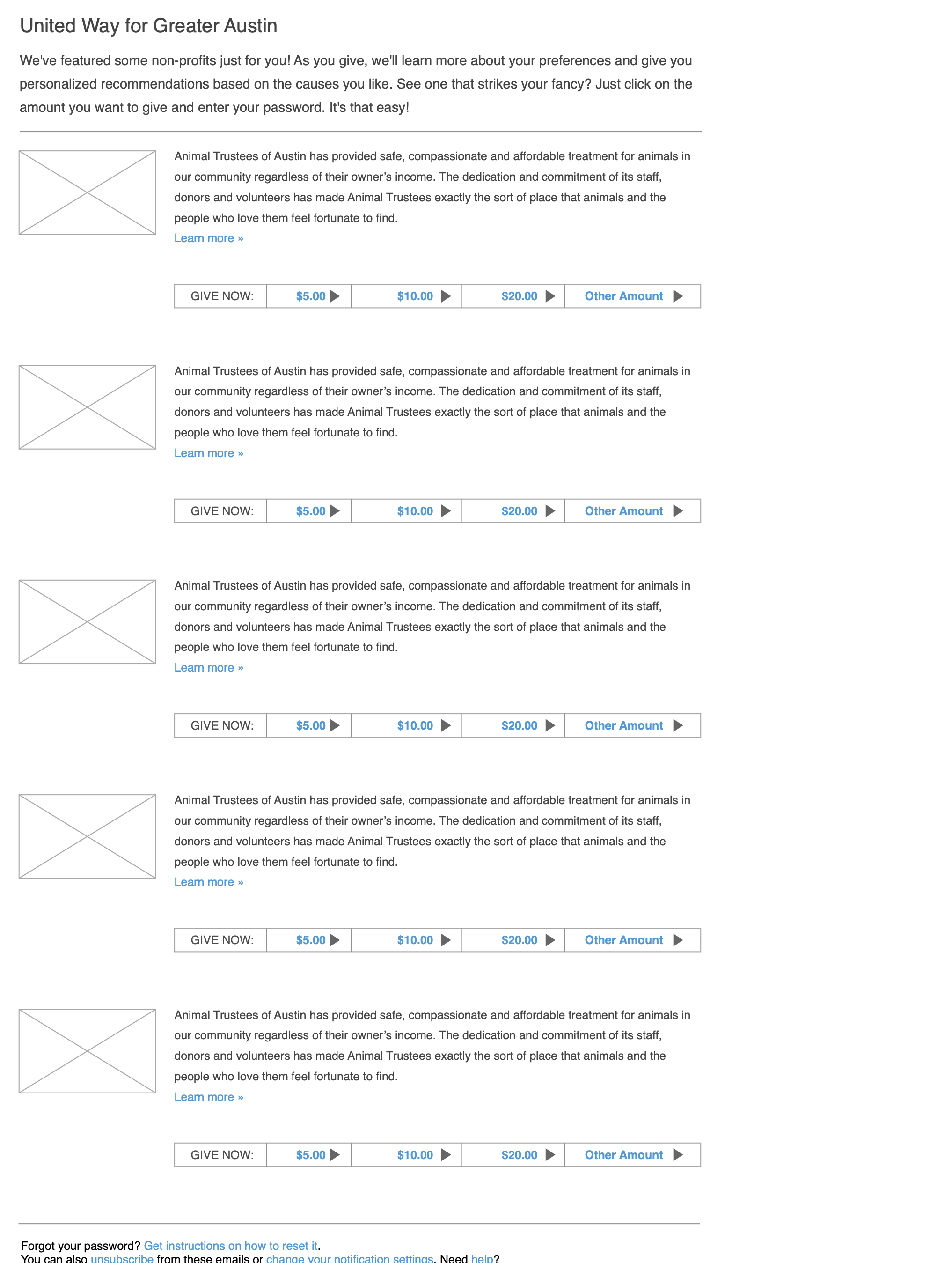
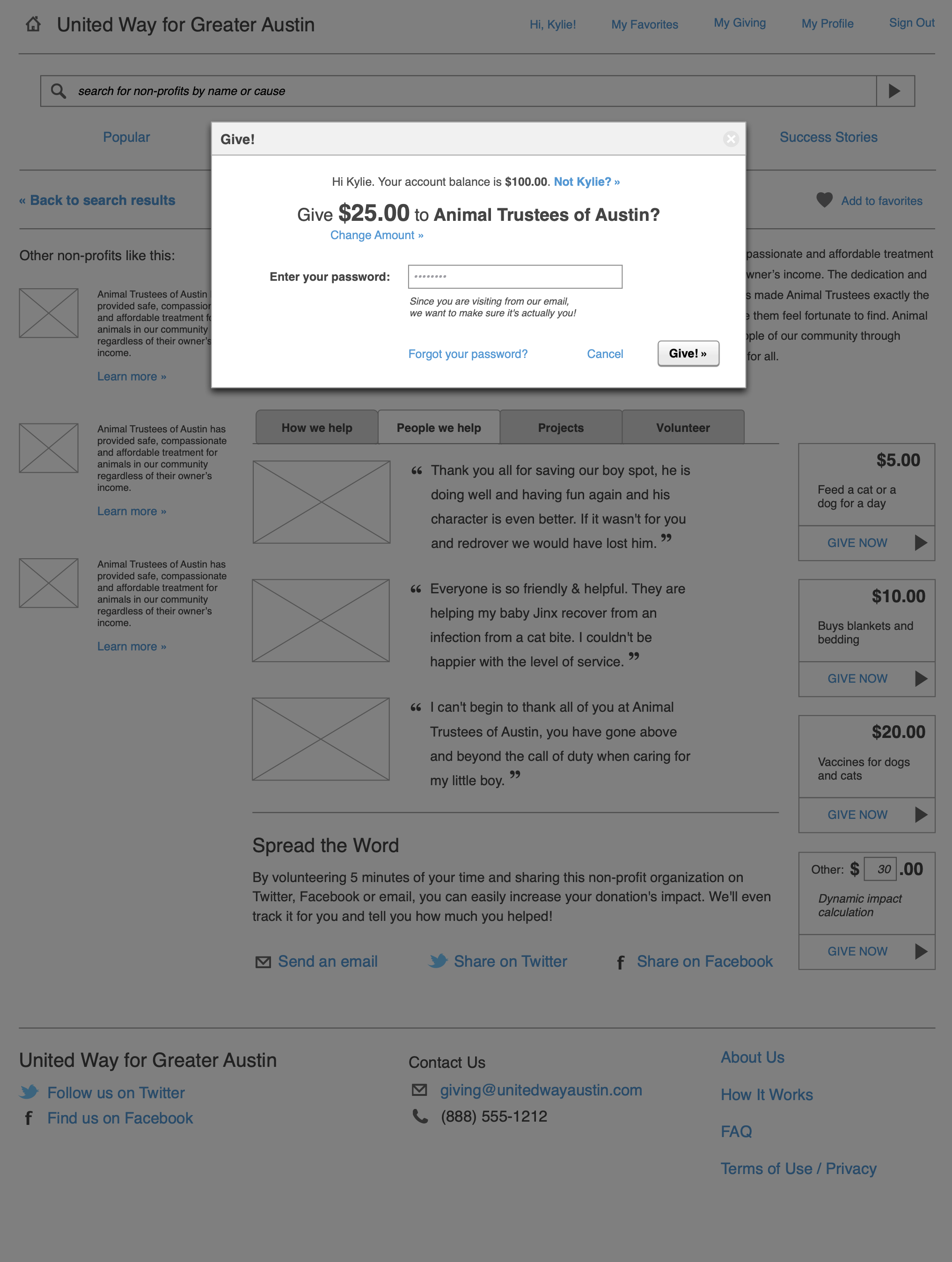
In addition to these principles, I proposed an online giving platform that could aggregate local non-profits, allow users to give a single monthly amount, and distribute at any time to a participating non-profit. In essence, this brings corporate giving programs to single donors and small businesses. I also incorporated ideas such as a giving “report card” and micro-volunteering to help people stay engaged and learn about new non-profits that meet their interests. I provided sample mockups and flows to describe potential goals, tasks and features.
Lessons Learned
Bringing the client in for synthesis was critical for building consensus. When I first discussed what I thought the themes might be, UWATX people were skeptical. Once they participated in looking at and synthesizing data, they completely agreed with my conclusions, but more importantly, brought new and important insights to the table.
In hindsight, I wish we had engaged non-profits and small businesses at the start. As it stands, we will be engaging them in a second phase to figure out the overall viability of the proposed platform and to understand best how to build a revenue stream to pay for development.